Tiffany spoke to No Plastic Sleeves blog about the marketing campaign she and I put together.
http://blog.noplasticsleeves.com/tiffany-browns-2011-promotional-campaign/
Your Custom Text Here
Tiffany spoke to No Plastic Sleeves blog about the marketing campaign she and I put together.
http://blog.noplasticsleeves.com/tiffany-browns-2011-promotional-campaign/
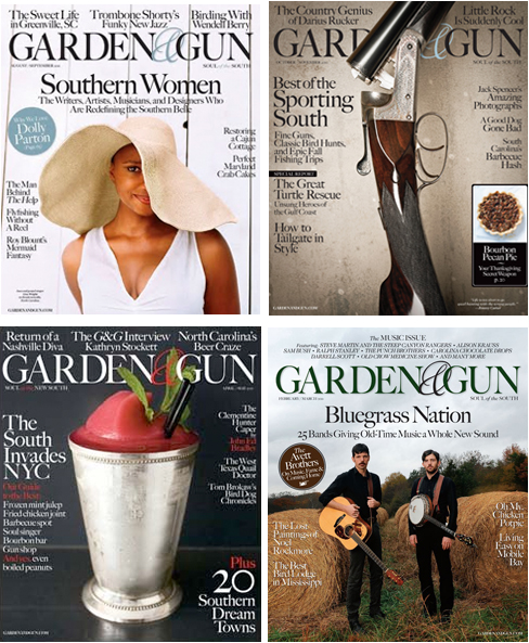
Why do you think Garden & Gun is at the top of so many people’s “dream clients” lists.
That’s amazing. We’re fortunate that photography is a focus of the magazine’s design. A lot of full page images and great paper stock to ensure high quality reproduction. Our readers let us know how much they relate to the photography each issue. We’ve always been a photo friendly publication.
You have hired Peter Frank Edwards for many stories, and one of those recently won a James Beard Award. Can you describe what it is in Frank’s work that keeps you coming back? How do you two work together? Is it a collaborative process?
I’ve had the pleasure of working with Peter Frank Edwards since the very first issue of Garden & Gun (Spring 2007). He’s from the South, spent his life in the outdoors, and previously was a fisherman and sous chef. Peter Frank Edwards IS Garden & Gun! He’s covered everything from hole-in-the-wall barbecue joints to traditional foxhunting and continues to get excited by every assignment. He lives the pages of the magazine so really gets what we’re all about.
It is very much a collaborative process. There is a level of trust after working together for many years. I know he is going to find the creative angle with each assignment and bring back the unexpected. I always look forward to his tales from the road. (Read more about their collaboration in my Q&A with Peter Frank Edwards).
You use such an amazing variety of types of photographers, that it is hard to pigeonhole Garden & Gun as having a particular style. How do you describe the visual aesthetic to people?
I like to work with a mix of national photographers and Southern-based talent in each issue and try to deliver the unexpected whether it’s for the front or back of the magazine or a feature.
It’s a balance between seasoned well-known shooters and up-and-coming photographers. We always strive for images that communicate a sense of place. Images that make you want to be there, in that moment. We like lots of natural light and rarely incorporate conceptual photography.
Walk us through a “typical” day at work.
Garden & Gun has a small staff so each component of photography and the overall process is very hands on. The magazine contains a wide variety of content so each day is filled with assignments ranging from Southern food and chefs, hunting and fishing, architecture and interiors, portraiture, music, you name it.
The magazine covers a wide editorial range and incorporates a high/low mix of content. For example, a profile of actress Anna Camp or a new modern architectural project verses gritty and soulful juke joints or frogging in Louisiana. Every day is exciting and keeps me on my toes. I also like to set aside time each week to respond to inquiries, research photographer’s new work, etc.
How many print and email promotions do you receive in an average week? Have any stood out to you lately, enough to where you actually contacted the photographer?
I receive about 30 promos a week. Bryan Johnson sent me a promo that turned into an online photo essay for G&G. The content was perfect for us: http://gardenandgun.com/newsletter/spill-one-year-later.
When being promoted to, do you prefer print or email?
Both are great, so however the photographer is most comfortable showcasing their work. I’m old school and still love print. I continue to hold onto those real standout print promos. Witty design on quality paper with gorgeous photographs always excites me.
Do you have any pet peeves when it comes to the marketing materials photographers send you?
Do not send emails with large file attachments. Be familiar with the magazine’s content and visual style and send an appropriate selection of photos. I prefer a tighter, well-constructed edit rather than a large quantity of work. Websites should be easy to navigate and show me images immediately.
What are some of your favorite ways to discover new photographers?
All types of blogs (photo, galleries, designers, magazines, etc.), chatting with people in the industry, those standout promos I receive, and an occasional portfolio review.
Questions from photographers
1. Is it OK to call Photo Editors to follow up after sending a promo?
Email follow up is great and always easier than phone calls.
2. When I send an email, should it be in a email newsletter format or will a simple note saying what I've been up to suffice?
Either is fine. Be sure your work is easy to view.
3. Do you take a chance on photographers just starting out fresh out of school?
Yes.
4. What is the best way to get noticed by a photo editor and ultimately hired to shoot a job?
Develop your own style, have confidence in your work, and do your research on each publication you approach. Send quarterly updates about your projects, travels, etc. I just worked with a photographer for the first time I’ve been corresponding with for two years. Everything has to fall into place before that project can become a reality.
5. What are some of the qualities of an ideal photographer to work with?
Passionate about their work, down-to-earth, excited to tackle all kinds of challenges, professional, someone who thinks outside of the box and brings something new and fresh to the table visually.
6. Can you share some names of some photographers whose work you are inspired by?
I love to look at classic Southern icons (Jane Rule Burdine, William Christenberry, Sally Mann) as well as current shooters (Marcus Nilsson, Peggy Sirota, Andrea Fazzari, Ditte Isager, Trujillo- Paumier).
7. What is the most interesting shoot, photographically, so far?
The next one...

Peter Frank Edwards G&G Cover
photos by (clockwise from top left): Joey and Jessica Seawell, Dan Winters, David McClister and Michael Turek

Bryan_promo

Miller Mobley Spread

Maggie Kennedy is the photography director of Garden & Gun magazine. She previously worked as a creative director and producer of commercial photography in San Francisco and New York with an emphasis on food, still life, and interiors.

Tell us about how your relationship began with Garden & Gun. Did they contact you?
Garden & Gun contacted me when they were in the planning stages for the launch of the magazine -- well before the first issue came out. As I recall, at that time there was no real photo or art department. They sort of "reorganized" after a couple of issues, made some staff changes. I've enjoyed a great relationship with them.
Can you describe your work process with Director of Photography Maggie Brett Kennedy? Do you collaborate on ideas? is the editing process collaborative?
Yes -- we do collaborate on ideas -- which can be anything from a quick phone call to bouncing sketches back and forth. We talk less about composition and set-ups and more about texture, color, mood, etc. She is interested in and respects photographers' points of view and is genuinely interested in the creative processes of each photographer she works with. I always feel like they are hiring me (or other photographers) to "do what we do" -- there's a lot of trust in that. The edit is also collaborative, and she's always interested in what I think tells the story or what I'd like to see published.
What's the most challenging shoot you've done for them and why?
One of the most technically challenging shoots was an assignment covering the oil spill. They sent me to Louisiana right as the oil was just starting to show up in the marshes. I had a lot of ground to cover in a very short period of time, and because of the time frame there was no opportunity to get official press credentials. I'd show up places, and even though we had called ahead and had a contact at an area or location, the National Guard or local police would not let me in. In addition, it was about 100 degrees and 100 percent humidity, and all the camera gear was fogged up and would literally drip with condensation. I had one little camera that seemed immune to this problem, probably because it's more plastic and less metal and glass.
What's your all time favorite story?
I worked on a piece about a North Carolina BBQ road trip with writer Sandy Lang -- we got the call on a Tuesday and we were on the road Friday.

It was a very stream of consciousness couple of days -- we met some characters, ate tons of great food -- and it was one of those assignments where you feel like you're getting gold at every click of the shutter.
Why do you think G&G is on everyone's dream client list right now?
Both Maggie and Marshall McKinney (art director) give photographers a lot of creative freedom, and you can see that come through in the stories and the single images. They treat the work well and with respect -- they are champions of great imagery.
___________________________________

A former fish monger and sous chef with a degree in anthropology, Frank was born and raised in coastal South Carolina. During college, he practiced photography at a camera shop and was soon off to Europe – and ultimately to Berlin – where he shot artist portraits and projects before returning to the American South, to live again by the ocean. In his photography, Frank mixes his passions for travel, people and food. When not on location, he splits time between his Charleston home and a cottage in Maine.

Amy Eckert, a commercial and editorial photographer (and also a fine artist and McKnight fellow) hired me to help her revamp her website and portfolio in the lead up to a move to Los Angeles. We started by talking about her goals, which include expanding her commercial client base and making sure that people knew she was based in LA. I went through all of her work and re-edited the images to appeal to the clients she is trying to reach. We reorganized the structure of her galleries as well.
We worked together, along with Scott Mullenberg at portfoliodesignstudio.com, to design a new print book with bold colors and a beautiful handmade slipcase.
Amy did all of the printing herself (which she says she really enjoys doing), on Pina Zangaro double sided bright white smooth matte, pre-scored.
Once everything was live, we created an email blast announcing the move to LA and encouraging people to come to the new site.
I can't believe we are already thinking about and planning for SXSW. It's only August! I dug through the SXSWi Panel Picker and found some interesting photo-related panel proposals. Remember to vote for the ones you'd like to attend so they make it into the program.
There are also many magazine publishing, content, social media marketing, content marketing, storytelling and advertising panel proposals that will be of interest to those of you trying to get your head around who is going to pay for the photos you make. Which we should all be interested in right?
Know of any others that I missed? Please comment.
A Glimpse into the 21st Century Photo Shoot
Today’s editorial shoot doesn’t just end with a photo on the page in print. These days, editorial photographers need to think about how to transition an image to a number of different platforms, including online, smartphone, or tablet, in additional to print. Condé Nast’s VP of Digital Magazine Development and Vanity Fair’s Photography Director Susan White will review the evolution of the editorial photo shoot and what it takes to ensure the best shot in an expansive media landscape.
Is Our Photo-Madness Creating Mediocrity or Magic?
Description Over 100 million photos are uploaded to Facebook every day. There are 3.5 billion cameraphones in use around the world. Instagram reached 5 million users in just nine months. We are nearing the end of what Philip Gourevitch of The New Yorker called “the decade in which the world went camera-mad...the decade where everything is depicted, and every picture must be shared.” This panel will address the many ways in which the rise of mobile photography is affecting how we express our creativity, and how we connect and communicate every day. BONUS: We'll conclude with @Koci explaining how he builds his images and sharing a recipe toolkit for audience members to build their own.
Creative Business Models Beyond Copyright
Many small creative businesses - digital artists, photographers, musicians, technology developers - operate on a business models of "negotiate, protect, and sue" regarding intellectual property. It seems obvious - that's how the major studios and conglomerates operate. Some well known - and already established - creative acts like Radiohead and Cory Doctorow have bucked that system and experimented with totally new business models. But what about the small businesses that still need to pay the rent every month? This panel will explore alternative business models for smaller creative outlets that explore new approaches to intellectual property and copyright management.
iPhone/Mobile Photography: Who Gives a Fuck?
How has having an audience transformed photography in the last few years? Social photography, started on sites like Flickr, has been compressed and amplified through mobile applications, such as Instagram, and is approaching addictive behavior. This panel will explore the rise of mobile photography as seen through the popularity of Instagram and the addition of Path, Color, Facebook photos and any other mobile applications that may enter into the game before March 2012. This is not going to be a love-fest for Instagram and/or mobile photography, we plan on having a debate about the merits as well as the limitations of mobile photography. Some of the best mobile phone/Instagram photographers will attempt to answer the question “who cares?” while sharing tips to their success, checking out different camera apps that help us achieve a style, and orchestrating interactive mobile photography exercises where every single audience member can participate using hashtags on Twitter, Instagram, and Flickr (lolz) with live judging and jelly doughnuts for the winners. Because, really, who wants to go to a panel *without* jelly doughnut incentives?! We aren't only interested in discussions and plan on spending just as much time discussing and debating as we will having the audience taking pictures and participating.
n the digital age, a photo is more than just the image on the screen. Behind the pixels are hidden details such as date, time, location, camera settings and other information that capture a precise moment in time and provide a rich context for each image. Beyond the device-generated EXIF data, the addition of user-generated content such as titles, descriptions, subject and people tags becomes core to the photo. As a photo gains momentum and is shared on Tumblr, re-tweeted on Twitter or tagged, each additional interaction adds another layer of context and dimension that can take story telling to a whole other level. With metadata, photos have evolved from a personal shoebox of memories to a powerful collective database of information on the internet with endless applications and possibilties. At Flickr we are developing ways to extract and understand information from photos to build out even better ways to share your photos. This session will introduce you into the potential data a photo is generating and the possibilities to use this data in order to create full and rich stories around a single or a collection of images.
Being Analog in a Digital World
Being analog in this increasingly digital world is rough. This panel explores how everything from meetups, sewing, music, film photography and crafting has found their way in a digital realm.
Multiplatform Storytelling: Frontline War Stories
While the academics preach of the wonders and promise and “mechanics” of “transmedia” storytelling, there are pioneering producers on the ground really doing it. There are good days and bad. There is money and there is not. And then there are the fans. What does it take to pull off successful multiplatform storytelling? We are at the birth of a new industry, an inflection point, much like the history of film or radio or television or even the Internet where technology gives rise to a new means to tell stories. It is a time before the “institutionalization” of the multiplatform industry. And just like the history of film or TV the early pioneers are stepping out now and taking a lot of arrows. They are experimenting, learning what works and establishing best practices. They are master storytellers using and in some cases inventing new tools. They have failed and they have succeeded. And these are their stories.
The Austin Center for Photography is looking for self-published photo books and zines to sell at the Texas Book Festival October 22-23, 2011. The Texas Book Festival attracts over 40,000 visitors in downtown Austin every year. ACP is excited to be a part of it and to share the world of photo books with a large audience. There is no charge to submit materials and proceeds from any sale are split 70-30 between the artist and ACP (with the artist receiving 70%).
If you would like to have your publication considered please submit:
All materials should be sent to the following address to be received by October 8, 2011:
Austin Center for Photography Attn: Book Festival 1211-B Marshall Lane Austin, Texas 78703
Fine Print: Submissions will be reviewed by members of the ACP Board of Trustees. Accepted artists will be notified by email. If your submission is not accepted or if it is accepted but does not sell during the festival, it will be returned to you in the postage-paid return envelope if provided -- otherwise it will be considered as a donation to ACP.
Questions? Email us at bookfest@visitacp.org.
Read more about ACP at the Texas Book Festival
Shannon, thank you for taking the time to share your opinions about self-promotion with the photographers and illustrators who read this blog. Can you start by describing a typical day for you at GSD&M?
Every day at GSD&M is different, which is nice because it keeps the work-life scenario interesting. Production is hectic, fun, stressful, an adrenaline rush, and a love/hate relationship. There is definitely never a dull moment!

Each job is a different can of worms but, you learn something new every time. I spend most of my days answering emails, putting together bids, submitting estimates, negotiating with reps or photographers, doing stock searches, chasing down creatives, and looking at Good & Not-So-Good work. However, there are some days that I'm not at my desk due to meetings, which is a challenge, because you still have to find the time to squeeze in all the administration required for the entire business. Keeping a list of "To-Do's" really helps me keep it all check because otherwise the small details can get missed. The best part of my job is that I do have days when I DO spend all day searching for hot new talent. I have a long list of photographers categorized by Conceptual, Fashion, Lifestyle, Portraits, Landscape, etc., but I'm always on the look-out for additions to the list. My job is challenging, frustrating, detail-oriented, and ultimately rewarding... I love it!
How many unsolicited emails do you get every week from photographers?
I probably get about 50 emails a day.
How do you handle all of those? Do you bookmark any sites because of them?
If an image or two pops up, I do take the time to review. If I like the work I do bookmark the work. If the email has a long drawn out message + a link, I'll either quickly click the link or just delete it. I do like to give everyone an opportunity but some days I'm just way too busy to read and review the work.
How many print promos do you get each week? How does that compare to a couple of years ago?
It's a joke how much mail I still receive and toss out. Let's just say sometimes the mailroom has to bring me my mail in a box. Compared to a couple of years ago, I feel it hasn't changed much except that I've noticed promos aren't as elaborate. I'm seeing more posters, larger postcards with multiple images and accordion style promos.
Most of the samples of promos you gave me that you liked feel more special and custom. How do you respond to the more simple postcard promos?
Most of the time the single picture postcards end up in the trash, unless the subject is interesting, unique or funny and it's just a damn good shot. I like to be inspired and intrigued. The postcards with multiple images can give you a better idea on the quality of the work. I also feel sometimes the one picture postcards end up being a 'one hit wonder'. (see examples of single postcards in gallery at bottom of page)
Which format, print or email promos, do you prefer?
I still like both. Some of the promos I see as an art piece. I love when a promo is a well designed cohesive piece (paper, design, 3+ images). Oh, and I LOVE the coffee table books!

How do you feel about unconventional or gimmicky promos: boxes of candy, matches, treasure hunt maps, ransom letters, etc. These seem to be very popular lately because they have the potential to garner a lot of attention on blogs. But do they really make a better impression with you than simpler printed promos?
The gimmicky promos do get my attention but doesn't necessarily convince me to save the work.

If you could change one thing about the way photographers reach out to you, what would it be?
Limit the number of times you send emails per month. I get emails from the same group of reps/photographers every week to every two weeks. I think once a month to every 3 months is sufficient. When emails start to come every week, I just end up deleting and not taking the time.
What are some of your favorite ways to learn about new photographers?
I think what Wonderful Machine is a great idea for agencies and photographers. I also recently sourced AtEdge, FoundFolios, PDN and we sent a group to LeBook.

I know you have participated in portfolio reviews in the past. do you think those are a good investment for photographers? Have you formed any new relationships with photographers because of them?
I really do think the reviews are a good investment. I personally try to be honest and provide constructive criticism. I've kept in touch with several photographers and continue to provide feedback. I want to helpphotographers grow and further their career.
During her 14 years in Advertising Shannon McMillan has worked as an Art Producer with worldwide clients (BMW, Kohler, Brinker, The US Air Force, Southwest Airlines, AT&T, AARP, Harrah's, and others), talented photographers and production teams, and reviewed hundreds of portfolios, websites and promos. She has been a juror for panels such as: PDN’s PIX, PDN’s Photo Annual, and the Palm Springs Photo Festival. She enjoys the sense of satisfaction and accomplishment that comes creative power and strives to maintain her artistic integrity. Photography is her personal passion and she looks forward to any opportunity to create.

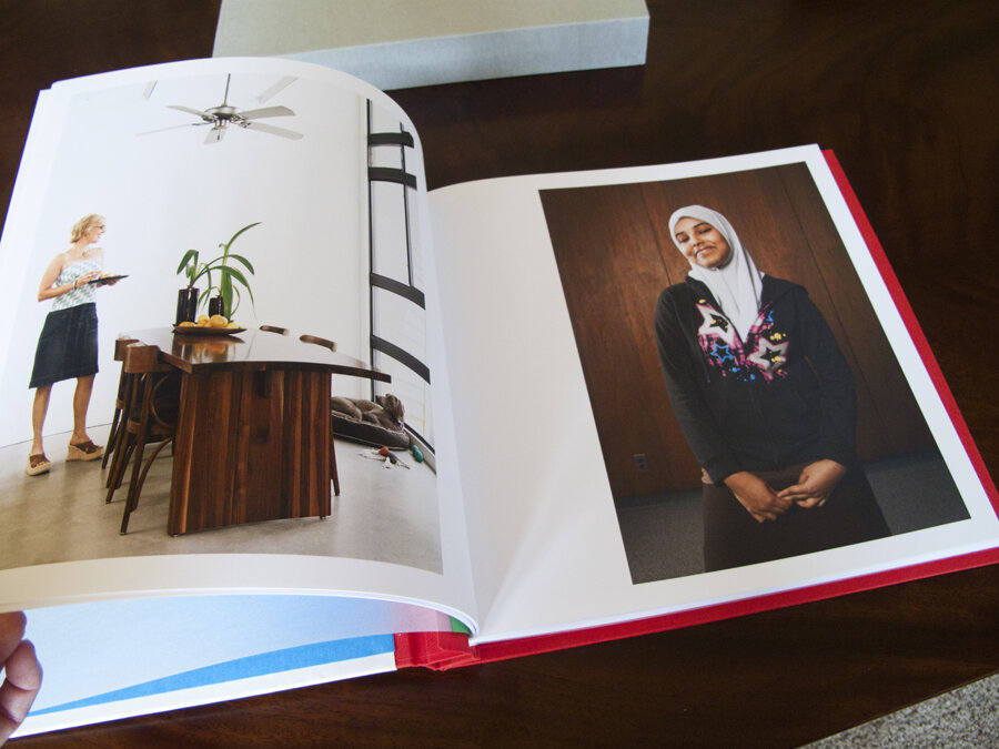
Kainaz Amaria needed help focusing her website and print portfolio edits to better convey the kind of work she wants to be known for. We talked about her style and where she wants to see her business go in the next couple of years. Then we got to work re-editing all of her images. We created new, more streamlined galleries on her site and built a print portfolio that reflected the changes.

After we completed the editing, we worked on print promo concepts. We knew we wanted to be able to show a variety of images and make a great first impression. Originally, we had a stack of 6 promo cards in a custom slip case printed in India. Unfortunately, the quality of the printing wasn't up to par and we had to start over. San Diego-based Modern Postcard came to the rescue with a custom printing solution that worked with Kainaz's budget. In the end, we modified the original idea to create one card that folds out. The card is 6x9 inches when folded, and folds out to 6x27 inches. Each panel is perforated so that clients can keep just one image if they want to.
Kainaz included a personal letter of introduction and her signature, and hand addressed all of her envelopes. I think it lends a very personal touch.

 June 2011 promos.")
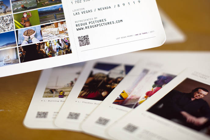
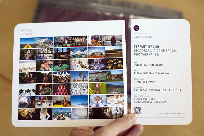
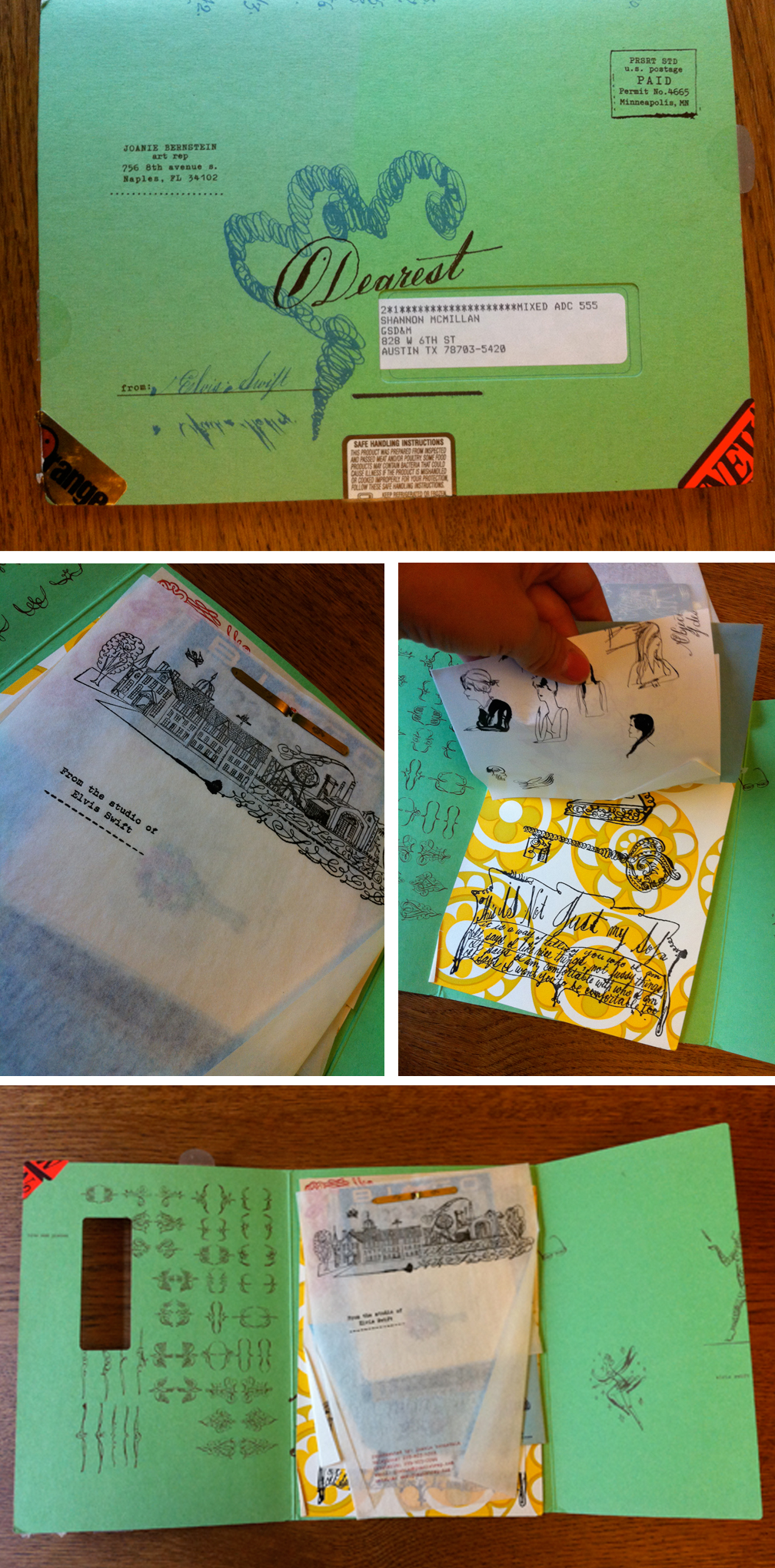
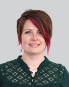
Las Vegas-based Tiffany Brown needed a marketing campaign that would announce her move from staff newspaper photographer to the freelance editorial and commercial market. Since Las Vegas is such a travel destination, we decided on a campaign built around the theme of boarding passes. With designer de-mo.org, we created a stunning promo consisting of 6 "boarding passes" sent out in a zip-sealed Mylar bag. We also created a print giveaway promotion and a coordinated email promo.
Read more about Tiffany's rebranding process on her blog.
This August I'll be doing 5 free portfolio, website, personal project or book dummy reviews for recent photography program graduates. Why? Because August is slow and recent grads are broke. Interested? Email me (info at jasminedefoore dot com) the following info: - Your name
- Your website if you have one
- Where you went to school and your date of graduation
- What you want me to review (a print portfolio, website portfolio, personal project or book dummy)
- A personal statement about you, your work, why I should look at it, etc
I'll be in touch with the 'winners' the first week of July to share details of what I need from you.
Happy Summer, Jasmine
Unconventional promos -- boxes full of toys, food, elaborate scavenger hunts, etc -- are getting a lot of attention these days. Despite the fact that a lot of art buyers and editors say they prefer simple promos, photographers are still churning out these pricey and attention-grabbing promos. Lately, it seems blogging about the promo sometimes gets more attention that the promo itself (Clint Davis and Casey Templeton come to mind). I like that people are documenting the process and sharing the promos in so many ways. Seeing a video of someone's promo go viral makes all the work, and often expense, more worth it.
When planning to do a promo like these, you need to really think about who your target market is and if it's worth the time and expense to reach them. You may be more effective doing something less expensive. Obviously the scale of these promos means they are not being sent to huge lists, so working on a really tight list of existing clients you love and dream clients you want to love you is key to making the most of your marketing dollar.
Below are Maggie's critiques of a few "out of the box" promos she has received recently.

Michel Leroy http://www.michelleroyphoto.com/ New York, NY What: 4 oranges and a promo card. Oranges are a great gift and they were a good tie-in back to photo on the promo card. The package colors, imagery, theme and design were all in-sync with each other. The promo card is a commercial/editorial portrait that is professional and a little weird (who bites into an orange?). It is different enough to grab my attention but not so weird as to confuse me.

Eric Schwabel http://schwabelstudio.com/ Los Angeles, CA What: Create-A-Face game. Peal and stick (re-stickable) photo decals to place on the face of a dude and build different (slightly frightening) characters. This was designed to impress creative directors and art buyers and I bet it will! I can imagine it was quite pricey to produce. But Eric thinks big and different. And, I think this is an unforgettable promo for tough to impress art buyers and ad agency creatives. For editorial, I think this might work with major newsstand publications but is slightly wasted on a business magazine photo editor like me.

Tony Gale http://www.tonygale.com New York, NY What: Remote control monster truck, ransom note, and promo card. The ransom note said that; in order to get the controller for the car, I need to make an appointment to see Tony’s new book. I have heard he is getting a great response. He has an all new website and this is his best promo card so far. My main complaint with this promo is that the red monster truck toy has nothing to do with his work, his subjects or the enclosed promo card and ransom note.

Wayne Brezinka (illustrator) http://www.brezinkadesign.com/ Nashville, TN What: 45 rpm coaster and a promo card. So cool I had to pick include an illustrator. When you go to his site the postcard image is top of page. Everything ties in beautifully. I really liked this promo, Wayne’s work, and his website. It’s a total coincidence that one of our art directors commissioned him the same week the promos arrived on their desks. (editor's note: also check out Matt Barnes' vinyl record themed promo)

Dave Moser http://davemoser.com/ Philadelphia, PA What: Custom Chocomize chocolate bar and two sets of promos. The first part of this promo was series of long elaborately branded cards. I almost didn’t notice that one of the long cards was a coupon for a free custom designed chocolate bar. Score! I designed a dark chocolate bar with toffee, peanuts, and sea salt. It is incredibly good. This sweet promo cost him a decent amount at $10. I don’t know if it will pay off for him with me because his style and subjects don’t mesh with the styles I hire for at my magazines. What does totally work for Dave is that I spent quality time on his site and I won’t forget his name (certainly not while there is still some chocolate left in my drawer).

Jen Judge http://www.jenjudge.com/ Santa Fe, NM What: Newspaper This mini newspaper has images and stories from her work in post-earthquake Haiti. All of the images are black & white, incredibly simple, and totally effective on the paper stock. I emailed her immediately, or maybe I called. (I do that sometimes). She told me that she just got the idea to print the newspaper and send it out. She hadn’t ever really promoted her work before but this was important to her. I love the idea. It works too because all the portraits are from the same project.
***
Are you one of the photographers' mentioned in this post (or have you done a similarly unconventional self promo piece)? It'd be great to hear from you about the response you've been getting, how much you spent on the promo and how you decided who to send them to.

Produced and edited a 36 page magazine highlighting some of the best work of four award-winning photo agencies. The theme was "Sustainable Industries" and featured stories ranging from renewable energy to organic farming, green jobs creation to eco-friendly building practices.
The magazine was sent to 2,000 creatives at graphic design firms, magazines and ad agencies as well as corporate marketing professionals.


original_redux00

original_redux01
Conceived and produced a 300+ page note pad as a promo piece which was sent to over 1,500 photo editors, art directors and art buyers. The note pad featured full bleed photographs by over 30 photographers and was designed by the awesome Spunk Design Machine. The feedback was great from clients and the piece won a PDN Self Promo Award.

16-page booklet designed to reference a CD book insert, highlighting recent work by Houston-based photographer Eric Kayne. Eric was hired by indie band The Arcade Fire to shoot publicity stills, behind the scenes reportage and concert images.
Every day people ask me if I know of any good web designers for portfolios. I usually point people to the more popular template products (aphotofolio.com, livebooks.com) and a handful of custom designers who seem to always be too busy to take on any new jobs. That's why I love the PDN Photo Annual Website section. It's a chance to check out a bunch of people I might not have heard of otherwise.
This year's winning websites were designed or coded by:
Lewis Carnegie (Austinite!) Jason Sherwin Noah Wall Hatch Design / Jay Meyers, TwinAct RAT / SMAUG (Italy) Canvas Group Aussie based design firm Mike Hartley Martin Fuchs (also winner of best company name): Shut Up I'm Awesome Toben another aussie shop Brian Hoff
A few of the websites were credited being designed or programmed by A Photo Folio. As far as I know, they don't do usually do custom work. If you buy a template from A Photo Folio, you are responsible for doing your own customization to make it look cool, and less like a template. I think the exception to that rule is if you are Dan Winters ;)
Happy clicking.
 It's that time of the year when you dig into the Photo Annual, remember all of the great work shot last year and discover some new gems along the way. But inevitably, a few months later I've forgotten some of these photographers so that's why I like to write it all down. Below are some of my favorites, in no particular order:
Advertising Nadav Kander's portraits for St John Ambulance campaign. Agency: BBH London Emiliano Granado's Converse campaign Jeremy & Claire Weiss's K-Swiss campaign. Agency: Adam&Co
Magazine/Editorial Peter Van Agtmael for The New York Times Magazine. Story: Jeff Bridges Christopher Griffith for Men's Health. Story: Contrasting images of youth and decay Robert Trachtenberg's hilarious nude group portrait of the cast of Jackass 3D inspired by Ritts' iconic supermodel shot Andreas Laszlo Konrath's black and white portrait of a model reading for New York Magazine Nigel Parry's portrait of Leonardo DiCaprio for Esquire. (Full disclosure: any portrait of Leonardo would end up in my best of list) Tierney Gearon's very young cheerleaders for ESPN, The Magazine
Books Nguan's self-published Shibuya Tim Hetherington's Infidel, published by Chris Boot Ltd. Eugene Richard's War is Personal Timothy Archibald explores learning to understand his son's autism in Echolilia/Sometimes I wonder
Photojournalism/Documentary Sarah Elliott's photograph of a Kenyan abortionist's "tools" Jana Romanova portrait from a series on sleeping couples who are expecting babies. Matt Eich's Baptist Town portrait for AARP Bulletin Ashley Gilbertson's "Bedrooms of the Fallen" project Darcy Padilla's amazing 18 year long documentary, "The Julie Project" Ben Lowy's BP Oil spill abstract seascapes for GQ
Personal Tim Gruber/Ackerman Gruber Images image from the series "The Island" Wayne Lawrence portrait series of people at Orchard Beach, aka "The Bronx Riviera" Magdalena Sole image of a baby on a porch, from "Cotton Land -- The Forgotten Mississippi Delta"

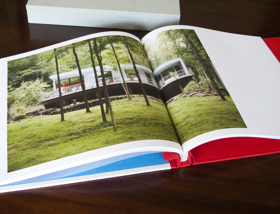
I recently wrapped up work with Matt Nager. Matt is a very talented portrait and documentary photographer whose old website was obscuring a lot of his strongest work. We started by talking about his strengths, defining what his main goals were and establishing the best way to spend his marketing dollars to reach those goals. We completely overhauled the website, resulting in a fresh and streamlined site powered by aphotofolio.com. His previous site featured too many choices of stories for editors to go through, so the new site is all about delivering his best images efficiently so that busy editors don't miss the strongest work.

We also put together a print promo (quantity 750 printed by paperchase.net) announcing his upcoming move to Denver. The promo features images that highlight his strengths in portraiture, travel and documentary.
My personal favorite part of our project was developing the print portfolio (I just love print books!). Matt teamed up with the very talented Scott Mullenberg at portfoliodesignstudio.com. Scott sent a variety of fabric samples for us to consider. We narrowed down the choices to a palette of blues and browns and finally decided on what you see below. I edited and sequenced Matt's work to highlight his diversity but also to show that he approaches all of his subjects with a consistent personal style and vision.
I am really happy with the finished product. Matt traveled to NYC and DC and got 23 meetings in just a little over a week. Upon returning home, Matt said "I think editors really liked having a physical book, it honestly made a huge difference." Many editors mentioned loving the colors as well. Actually showing your book to a lot of clients is the best way to gauge if the edit and sequence are right, and Matt might make a few tweaks to the book. But the overall impression was that "the sequencing was really great and showed off (his) versatility."
Of course now the real work begins... all of the follow up marketing that will help Matt capitalize on the the momentum we have built. To help with that, I created a year long marketing plan for him that incorporates suggestions for print promos, newsletters, social media and in person meetings.
Best of luck with the next year Matt!
Maggie Soladay (@maggiesoladay) generously shares critiques of print promos she receives. Here’s what she has to say about this week's batch:

1. Jonathan Robert Willis lives in Bellvue, Kentucky. I have been working with him for years as my go-to for Midwest portrait and lifestyle assignments. Luckily, I know that Bellvue, Kentucky is the Cincinnati metro area. His website and card don’t make that clear. In fact, his card lists a NYC number. The card is terrific and wild and I am guessing it’s aimed at advertising clients, which it should be. Though, for an editorial photo editor that doesn’t know him I think it would be tough to identify his region without digging. For example, he just shot an assignment for me this past month in Indianapolis, Indiana, a 1.5hr. drive from Cincinnati. In this batch of promos his really stood out. http://jonbob.com/
2. Brooklyn based Daniel Glazer’s card was meant to direct me to a video vignette of a model. Not my interest area or work area. Totally not the kind of photography we use. But, what Daniel shoots and how he shoots reminds me of why and how I got into photography in the first place. http://www.danielglazer.com
3. I want to love Van Ditthavong. He has been sending promos for a while. The current one has a bluish/cyan cast to it. Not great. Van has a great environmental portrait series called “Portrait of the American Dream” in which he photographed immigrants on the job wearing popular culture kids Halloween masks. I know him as Dallas based but the postcard and the website say Los Angeles and Dallas. That always irks me. Who lives in more than one place? http://vanphotographs.com
4. Milwaukee photographer Adam Ryan Morris has a good identity design that is simple, memorable and fun. Strikes me it represents him well. And his photography is good. Only one problem: his website has a commercial section and that makes no sense. He seems to have been much published in a couple of magazines, namely Milwaukee Magazine and that’s great. But I don’t see how the other work is or can be called commercial work? Confusing. A fun charming image on the postcard totally caught my interest and I remember him from previous similarly fun promo cards in the past year. http://adamryanmorris.com/
5. Knoxville, Tennessee’s Hollis Bennett is a great photographer with a sleepy promo card. The 3 images on his card are too dark and not very engaging. The work on his website on the other hand is fantastic. I could spend a lot more time there. Few photographers have the ability to give a sense of place to a story like he does. Hollis is the discovery of the week! Great work, great subjects, and totally original eye. If I wasn’t going to write about the promos I may not have ever visited the website due to the promo card alone. I am glad I did. http://www.hollisbennett.com/
(editor's note: number 6 was removed per photographer's request)
7. Michael Murphree’s card has a very straight picture of Cameron Diaz on a grey background. He included an 866 number and his URL but nothing else- no location, email, greeting or photo caption. I need to know where someone is located because I am a magazine photo editor and, like many, I haven’t seen a travel budget in years. I assumed Los Angeles and was correct. Where else would a picture of a celebrity be promotion enough? Some great work in the “human interest” section and some shots on grey of all of our favorite comedians. http://www.michaelmurphree.com/
***
I think Maggie's feedback is spot on. Especially:
- Know who you are targeting to and try to send an image that is relevant to what they do (my exception to that rule is when you are sharing personal work. I think it's ok to share something that is not totally relevant when your goal is to give the editor a better sense of who you are and what you are passionate about).
- Make it easy for the editor to know where you are based. Although photographers do sometimes get sent to other locations for assignments, for the most part, photo editors are looking for great regional photographers.
- Be mindful of the quality of your paper and reproduction
***
Check back next week when Maggie highlights some of the quirkier promos she receives (think box of oranges, remote control car, etc).
![]() 6pm EST is the new deadline to enter the New York Photo Festival Awards.
6pm EST is the new deadline to enter the New York Photo Festival Awards.
The 2011 edition of The New York Photo Awards features twelve category winners - including best fine art single, fine art series, documentary single, documentary series, advertising single, advertising series and photo book - one of whom will be selected for the Jury's Choice Prize, a $5,000 cash prize for best overall picture or series, presented by Persol.
As a former judge (2009) I'd like to share a few tips for preparing your entry. Of course judging is highly subjective and what each person will respond to is unique, but here are some basics to help you put together a good entry.
Remember, the judges will be looking at a lot of images. Do them a favor by showing work that is fresh, interesting, poignant, emotional, raw, subtle and unique. Sounds easy, right?

I feel ill-equipped to add much to the many poignant, heartfelt and eloquently written memorials others have posted for Chris and Tim. Yet, if I don't get something down on paper now, I know I will forget how I'm feeling, and forget the details of the horrible week when Chris Hondros and Tim Hetherington were killed while covering the fighting in Misrata, Libya.
Like so many others, I was shocked and sickened by the news. I remember reading that first tweet Wednesday morning and calling Jay at work. Surely it couldn't be true. Then following the thread back to facebook where the news first broke. I was sickened to think of Chris and Tim's families getting this news the way the rest of us were. As Teru Kuwayama so eloquently wrote, the social media world does not have the same rules as the military when it comes to announcing when someone was killed in action. We are navigating new waters. Maybe there was no better alternative. Maybe the news needed to be spread quickly to ensure that Chris and Tim's bodies would get out of Misrata quickly. But still, it felt so wrong.
My other first reaction was "not again." Are the journalists who give up their lives to tell important stories really helping? Are people's minds really changed? Does public policy change? Of course I want to believe it does. Again, someone else explained how I was feeling better than I could myself. Thank you David Alan Harvey.
I remember discovering my dad's copy of Philip Jones Griffith's Vietnam, Inc. when I was a kid. I must have been 12 or so. It sounds cliche but it really changed my life. I learned that the world is full of horrible things happening, things my protected existence had no idea about.
And it taught me that there are people who risk their lives, unarmed, to document those horrible things. Photojournalists. Later on I would move to NYC and surround myself with these kinds of people. Our generation's war photographers.
The photojournalism community is small, and the time Jay and I spent in NYC bred so many friendships. I imagine all of the pain our community is feeling around the world, the pain of Chris and Tim's families. The hoping and wishing that it was all just a rumor.
But it was true.
So many people have shared their memories of Chris and Tim. Thank you Sebastian Junger, Andrew Hetherington, John Kerry, CJ Chivers, James Pomerantz, Peter van Agtmael, Greg Campbell, Nicole, Tim, Spencer and Gary and many others for documenting what's in your hearts at this very emotional time.
I am so sad for everyone who loves Chris and Tim and whose lives were touched by the kind of men they were. But their images have created a legacy.
As my favorite band once sang, "There is a light and it never goes out".
***
In lieu of flowers, the loved ones of Chris Hondros kindly request donations be made to The Chris Hondros Fund. This fund will provide scholarships for aspiring photojournalists and raise awareness of issues surrounding conflict photography.
The Chris Hondros Fund
c/o Christina Piaia
50 Bridge Street #414
Brooklyn, New York 11201