Q&A with GSD&M Senior Art Producer Shannon McMillan

Shannon, thank you for taking the time to share your opinions about self-promotion with the photographers and illustrators who read this blog. Can you start by describing a typical day for you at GSD&M?

Every day at GSD&M is different, which is nice because it keeps the work-life scenario interesting. Production is hectic, fun, stressful, an adrenaline rush, and a love/hate relationship. There is definitely never a dull moment!

Shannon McMillan's Office at GSD&M

Each job is a different can of worms but, you learn something new every time. I spend most of my days answering emails, putting together bids, submitting estimates, negotiating with reps or photographers, doing stock searches, chasing down creatives, and looking at Good & Not-So-Good work. However, there are some days that I'm not at my desk due to meetings, which is a challenge,  because you still have to find the time to squeeze in all the administration required for the entire business. Keeping a list of "To-Do's" really helps me keep it all check because otherwise the small details can get missed. The best part of my job is that I do have days when I DO spend all day searching for hot new talent. I have a long list of photographers categorized by Conceptual, Fashion, Lifestyle, Portraits, Landscape, etc., but I'm always on the look-out for additions to the list. My job is challenging, frustrating, detail-oriented, and ultimately rewarding... I love it!

How many unsolicited emails do you get every week from photographers?

I probably get about 50 emails a day.

How do you handle all of those? Do you bookmark any sites because of them?

If an image or two pops up, I do take the time to review. If I like the work I do bookmark the work. If the email has a long drawn out message + a link, I'll either quickly click the link or just delete it. I do like to give everyone an opportunity but some days I'm just way too busy to read and review the work.

elvis_swift
elvis_swift

How many print promos do you get each week?  How does that compare to a couple of years ago?

It's a joke how much mail I still receive and toss out. Let's just say sometimes the mailroom has to bring me my mail in a box. Compared to a couple of years ago,  I feel it hasn't changed much except that I've noticed promos aren't as elaborate. I'm seeing more posters, larger postcards with multiple images and accordion style promos.

Most of the samples of promos you gave me that you liked feel more special and custom. How do you respond to the more simple postcard promos?

Most of the time the single picture postcards end up in the trash, unless the subject is interesting, unique or funny and it's just a damn good shot. I like to be inspired and intrigued. The postcards with multiple images can give you a better idea on the quality of the work. I also feel sometimes the one picture postcards end up being a 'one hit wonder'. (see examples of single postcards in gallery at bottom of page)

Which format, print or email promos, do you prefer?

I still like both. Some of the promos I see as an art piece. I love when a promo is a well designed cohesive piece (paper, design, 3+ images). Oh, and I LOVE the coffee table books!

buck_isnt
buck_isnt

How do you feel about unconventional or gimmicky promos: boxes of candy, matches, treasure hunt maps, ransom letters, etc.  These seem to be very popular lately because they have the potential to garner a lot of attention on blogs. But do they really make a better impression with you than simpler printed promos?

The gimmicky promos do get my attention but doesn't necessarily convince me to save the work.

christian_weber
christian_weber

If you could change one thing about the way photographers reach out to you, what would it be?

Limit the number of times you send emails per month. I get emails from the same group of reps/photographers every week to every two weeks. I think once a month to every 3 months is sufficient. When emails start to come every week, I just end up deleting and not taking the time.

What are some of your favorite ways to learn about new photographers?

I think what Wonderful Machine is a great idea for agencies and photographers. I also recently sourced AtEdge, FoundFolios, PDN and we sent a group to LeBook.

kretschmer
kretschmer

I know you have participated in portfolio reviews in the past. do you think those are a good investment for photographers? Have you formed any new relationships with photographers because of them?

I really do think the reviews are a good investment. I personally try to be honest and provide constructive criticism. I've kept in touch with several photographers and continue to provide feedback. I want to helpphotographers grow and further their career.


Shannon McMillan_head

During her 14 years in Advertising Shannon McMillan has worked as an Art Producer with worldwide clients (BMW, Kohler, Brinker, The US Air Force, Southwest Airlines, AT&T, AARP, Harrah's, and others), talented photographers and production teams, and reviewed hundreds of portfolios, websites and promos. She has been a juror for panels such as: PDN’s PIX, PDN’s Photo Annual, and the Palm Springs Photo Festival. She enjoys the sense of satisfaction and accomplishment that comes creative power and strives to maintain her artistic integrity. Photography is her personal passion and she looks forward to any opportunity to create.

Case Study: Kainaz Amaria

amaria_promo_image.jpg

Kainaz Amaria needed help focusing her website and print portfolio edits to better convey the kind of work she wants to be known for. We talked about her style and where she wants to see her business go in the next couple of years. Then we got to work re-editing all of her images. We created new, more streamlined galleries on her site and built a print portfolio that reflected the changes.

After we completed the editing, we worked on print promo concepts. We knew we wanted to be able to show a variety of images and make a great first impression. Originally, we had a stack of 6 promo cards in a custom slip case printed in India. Unfortunately, the quality of the printing wasn't up to par and we had to start over. San Diego-based Modern Postcard came to the rescue with a custom printing solution that worked with Kainaz's budget. In the end, we modified the original idea to create one card that folds out. The card is 6x9 inches when folded, and folds out to 6x27 inches. Each panel is perforated so that clients can keep just one image if they want to.

Kainaz included a personal letter of introduction and her signature, and hand addressed all of her envelopes. I think it lends a very personal touch.


Tiffany Brown Marketing Campaign

spring_promo04.jpg
spring_promo03
spring_promo03

Las Vegas-based Tiffany Brown needed a marketing campaign that would announce her move from staff newspaper photographer to the freelance editorial and commercial market. Since Las Vegas is such a travel destination, we decided on a campaign built around the theme of boarding passes. With designer de-mo.org, we created a stunning promo consisting of 6 "boarding passes" sent out in a zip-sealed Mylar bag. We also created a print giveaway promotion and a coordinated email promo.

Read more about Tiffany's rebranding process on her blog.

Photo Editor Maggie Soladay Critiques Unconventional Promos

Unconventional promos -- boxes full of toys, food, elaborate scavenger hunts, etc -- are getting a lot of attention these days. Despite the fact that a lot of art buyers and editors say they prefer simple promos, photographers are still churning out these pricey and attention-grabbing promos. Lately, it seems blogging about the promo sometimes gets more attention that the promo itself (Clint Davis and Casey Templeton come to mind). I like that people are documenting the process and sharing the promos in so many ways. Seeing a video of someone's promo go viral makes all the work, and often expense, more worth it.

When planning to do a promo like these, you need to really think about who your target market is and if it's worth the time and expense to reach them. You may be more effective doing something less expensive. Obviously the scale of these promos means they are not being sent to huge lists, so working on a really tight list of existing clients you love and dream clients you want to love you is key to making the most of your marketing dollar.

Below are Maggie's critiques of a few "out of the box" promos she has received recently.

Michel Leroy http://www.michelleroyphoto.com/ New York, NY What: 4 oranges and a promo card. Oranges are a great gift and they were a good tie-in back to photo on the promo card.  The package colors, imagery, theme and design were all in-sync with each other.  The promo card is a commercial/editorial portrait that is professional and a little weird (who bites into an orange?). It is different enough to grab my attention but not so weird as to confuse me.


Eric Schwabel http://schwabelstudio.com/ Los Angeles, CA What: Create-A-Face game. Peal and stick (re-stickable) photo decals to place on the face of a dude and build different (slightly frightening) characters. This was designed to impress creative directors and art buyers and I bet it will! I can imagine it was quite pricey to produce. But Eric thinks big and different. And, I think this is an unforgettable promo for tough to impress art buyers and ad agency creatives. For editorial, I think this might work with major newsstand publications but is slightly wasted on a business magazine photo editor like me.


Tony Gale http://www.tonygale.com New York, NY What: Remote control monster truck, ransom note, and promo card. The ransom note said that; in order to get the controller for the car, I need to make an appointment to see Tony’s new book.  I have heard he is getting a great response.  He has an all new website and this is his best promo card so far.  My main complaint with this promo is that the red monster truck toy has nothing to do with his work, his subjects or the enclosed promo card and ransom note.


Wayne Brezinka (illustrator) http://www.brezinkadesign.com/ Nashville, TN What: 45 rpm coaster and a promo card. So cool I had to pick include an illustrator.  When you go to his site the postcard image is top of page.  Everything ties in beautifully. I really liked this promo, Wayne’s work, and his website.  It’s a total coincidence that one of our art directors commissioned him the same week the promos arrived on their desks. (editor's note: also check out Matt Barnes' vinyl record themed promo)


Dave Moser http://davemoser.com/ Philadelphia, PA What: Custom Chocomize chocolate bar and two sets of promos. The first part of this promo was series of long elaborately branded cards. I almost didn’t notice that one of the long cards was a coupon for a free custom designed chocolate bar. Score! I designed a dark chocolate bar with toffee, peanuts, and sea salt. It is incredibly good. This sweet promo cost him a decent amount at $10. I don’t know if it will pay off for him with me because his style and subjects don’t mesh with the styles I hire for at my magazines. What does totally work for Dave is that I spent quality time on his site and I won’t forget his name (certainly not while there is still some chocolate left in my drawer).


Jen Judge http://www.jenjudge.com/ Santa Fe, NM What: Newspaper This mini newspaper has images and stories from her work in post-earthquake Haiti.  All of the images are black & white, incredibly simple, and totally effective on the paper stock.  I emailed her immediately, or maybe I called.  (I do that sometimes).  She told me that she just got the idea to print the newspaper and send it out.  She hadn’t ever really promoted her work before but this was important to her.  I love the idea. It works too because all the portraits are from the same project.


***

Are you one of the photographers' mentioned in this post (or have you done a similarly unconventional self promo piece)? It'd be great to hear from you about the response you've been getting, how much you spent on the promo and how you decided who to send them to.


Redux Pictures Magazine

reduxmagazine
reduxmagazine

Produced and edited a 36 page magazine highlighting some of the best work of four award-winning photo agencies. The theme was "Sustainable Industries" and featured stories ranging from renewable energy to organic farming, green jobs creation to eco-friendly building practices.

The magazine was sent to 2,000 creatives at graphic design firms, magazines and ad agencies as well as corporate marketing professionals.

Picture 13
Picture 13
Picture 12
Picture 12

Matt Nager

Picture-103.png

I recently wrapped up work with Matt Nager. Matt is a very talented portrait and documentary photographer whose old website was obscuring a lot of his strongest work. We started by talking about his strengths, defining what his main goals were and establishing the best way to spend his marketing dollars to reach those goals. We completely overhauled the website, resulting in a fresh and streamlined site powered by aphotofolio.com. His previous site featured too many choices of stories for editors to go through, so the new site is all about delivering his best images efficiently so that busy editors don't miss the strongest work.

We also put together a print promo (quantity 750 printed by paperchase.net) announcing his upcoming move to Denver. The promo features images that highlight his strengths in portraiture, travel and documentary.

My personal favorite part of our project was developing the print portfolio (I just love print books!). Matt teamed up with the very talented Scott Mullenberg at portfoliodesignstudio.com.  Scott sent a variety of fabric samples for us to consider. We narrowed down the choices to a palette of blues and browns and finally decided on what you see below. I edited and sequenced Matt's work to highlight his diversity but also to show that he approaches all of his subjects with a consistent personal style and vision.

I am really happy with the finished product. Matt traveled to NYC and DC and got 23 meetings in just a little over a week. Upon returning home, Matt said "I think editors really liked having a physical book, it honestly made a huge difference." Many editors mentioned loving the colors as well. Actually showing your book to a lot of clients is the best way to gauge if the edit and sequence are right, and Matt might make a few tweaks to the book. But the overall impression was that "the sequencing was really great and showed off (his) versatility."

Of course now the real work begins... all of the follow up marketing that will help Matt capitalize on the the momentum we have built. To help with that, I created a year long marketing plan for him that incorporates suggestions for print promos, newsletters, social media and in person meetings.

Best of luck with the next year Matt!

Photo Editor Maggie Soladay Critiques a Week of Promos

Maggie Soladay (@maggiesoladay) generously shares critiques of print promos she receives. Here’s what she has to say about this week's batch:

1. Jonathan Robert Willis lives in Bellvue, Kentucky. I have been working with him for years as my go-to for Midwest portrait and lifestyle assignments.  Luckily, I know that Bellvue, Kentucky is the Cincinnati metro area.  His website and card don’t make that clear.  In fact, his card lists a NYC number.  The card is terrific and wild and I am guessing it’s aimed at advertising clients, which it should be.  Though, for an editorial photo editor that doesn’t know him I think it would be tough to identify his region without digging.  For example, he just shot an assignment for me this past month in Indianapolis, Indiana, a 1.5hr. drive from Cincinnati.  In this batch of promos his really stood out.  http://jonbob.com/

2. Brooklyn based Daniel Glazer’s card was meant to direct me to a video vignette of a model.  Not my interest area or work area. Totally not the kind of photography we use.  But, what Daniel shoots and how he shoots reminds me of why and how I got into photography in the first place. http://www.danielglazer.com

3. I want to love Van Ditthavong.  He has been sending promos for a while.  The current one has a bluish/cyan cast to it.  Not great. Van has a great environmental portrait series called “Portrait of the American Dream” in which he photographed immigrants on the job wearing popular culture kids Halloween masks.  I know him as Dallas based but the postcard and the website say Los Angeles and Dallas.  That always irks me. Who lives in more than one place? http://vanphotographs.com

4. Milwaukee photographer Adam Ryan Morris has a good identity design that is simple, memorable and fun. Strikes me it represents him well. And his photography is good. Only one problem: his website has a commercial section and that makes no sense.  He seems to have been much published in a couple of magazines, namely Milwaukee Magazine and that’s great.  But I don’t see how the other work is or can be called commercial work? Confusing.  A fun charming image on the postcard totally caught my interest and I remember him from previous similarly fun promo cards in the past year.  http://adamryanmorris.com/

5. Knoxville, Tennessee’s Hollis Bennett is a great photographer with a sleepy promo card. The 3 images on his card are too dark and not very engaging.  The work on his website on the other hand is fantastic.  I could spend a lot more time there.  Few photographers have the ability to give a sense of place to a story like he does.  Hollis is the discovery of the week!  Great work, great subjects, and totally original eye.  If I wasn’t going to write about the promos I may not have ever visited the website due to the promo card alone.  I am glad I did. http://www.hollisbennett.com/

(editor's note: number 6 was removed per photographer's request)

7. Michael Murphree’s card has a very straight picture of Cameron Diaz on a grey background. He included an 866 number and his URL but nothing else- no location, email, greeting or photo caption. I need to know where someone is located because I am a magazine photo editor and, like many, I haven’t seen a travel budget in years.  I assumed Los Angeles and was correct. Where else would a picture of a celebrity be promotion enough?  Some great work in the “human interest” section and some shots on grey of all of our favorite comedians. http://www.michaelmurphree.com/

***

I think Maggie's feedback is spot on. Especially:

- Know who you are targeting to and try to send an image that is relevant to what they do (my exception to that rule is when you are sharing personal work. I think it's ok to share something that is not totally relevant when your goal is to give the editor a better sense of who you are and what you are passionate about).

- Make it easy for the editor to know where you are based. Although photographers do sometimes get sent to other locations for assignments, for the most part, photo editors are looking for great regional photographers.

- Be mindful of the quality of your paper and reproduction

***

Check back next week when Maggie highlights some of the quirkier promos she receives (think box of oranges, remote control car, etc). 


Photo Editor Maggie Soladay's Self-Promo Picks

Maggie Soladay takes photos of her favorite promos. Here's what she had to say about last Monday's batch:

The planets aligned Monday to deliver to me one of the tightest batches of photographer postcard promos in a while. I only received 6 postcards, but all 6 photographers made it onto my new photographer list. What I loved about the cards was the love the photographers showed for people and portraiture.

Every one of the photographers sent me postcards that alluded well to the work I was to see on their sites.  Most exceeded my expectations.  I laughed, entertained co-workers, and hung some of these on my wall (rather than send them right into the recycle bin). This batch of postcards were all beautiful, technically proficient, and showed originality.  I must say they look pretty good all together somehow too!

Maggie Soloday's Favorite Promos from Week of April 19, 2011

Maggie Soloday's Favorite Promos from Week of April 19, 2011

Jayne Wexler from NYC http://www.jaynewexler.com
Sara Rubenstein from Minneapolis, MN http://rubinsteinphoto.com/
Jeff Singer from San Francisco, CA http://www.jeffsingerphoto.com
Bryan Regan from Raliegh, NC http://bryanreganphotography.com
Jenn Ackerman + Tim Gruber from Minneapolis, MN  http://ackermangruber.com/
Joshua Paul from NYC http://joshuapaul.com/

Photo editor Maggie Soladay photographs the snail mail postcard promos that arrive each week (unedited) and posts them on Twitter @maggiesoladay.  She thinks photographers benefit by seeing what photo editors see and are hopefully inspired. She is the photography editor at ALM for The American Lawyer Magazine (the RollingStone of the legal world) and Corporate Counsel Magazine.

The Problem Isn't Photo "Spammers"

A few days ago, a creative director with an axe to grind threw up a poorly conceived website aimed at stopping what he calls "photo spammers". He named specific photographers who he claimed were guilty of being "spammers" because they had sent unsolicited e-promos. He, along with a handful of other creative directors (note: no art buyers signed the list) pledged to not hire these blacklisted photographers. The photo blogosphere lit up (see aphotoeditor.com and mediabistro.com), with people pointing blame at certain photographers, reps, database products like Agency Access and Adbase and email marketing products like MyEmma and Mailchimp.  Said creative director claims he was just trying to start a conversation about a system which is broken.Well he certainly got people talking, but not very constructively.

What nobody seems to be mentioning is that the problem is not the fault of any one party. The problem lies in the fact that there are just too many photographers trying to make a living doing what they love and not enough jobs to go around.

The barriers to entry into the profession continues to dwindle. Technology has made it very easy to make good looking pictures. iPhone photos are winning World Press Photo and being published in Martha Stewart and The New Yorker.  (I'm not saying all you need is an iPhone to be a good photographer... of course you have to have a good eye and a sense for what makes a compelling image). Technology won't slow down, so this is a given that we have to accept.

And at the same time that it is getting easier and cheaper to make great pictures, there are fewer ways to make a decent living doing it. This has been argued to death on other sites and I won't go too much into it. But it's important to admit that the pie is getting smaller and there are a lot more people wanting a slice.

Staff changes at the places that hire photographers have made it so that art buyers, photo editors and creative directors are responsible for a bigger workload than ever before. So they have even less time to be sifting through e-promos, yet the amount they are getting is at an all time high.

Not to mention the erosion of copyright and the licensing model...

To say the system of self-promotion is broken is too simplistic. A well thought out and well-targeted marketing plan that uses a combination of producing new work, sending print promos, e-promos/newsletters, social networking, in-person networking and following up is still essential.

My advice for photographers: DO NOT send any kind of promo (print or email) to someone who does not work on projects that you are right for. For magazines, this should be pretty easy. Just go to the newsstand and look at them.  When pitching to art buyers, make sure you know what accounts that agency is working on. If you can't name what a certain creative on your list does, then you probably shouldn't be marketing to them. This takes a lot of discipline and research time but it is very important.

Also, make sure you are complying with the CAN-SPAM act, which requires you to include a physical address and an unsubscribe link in every email.

And most importantly, make it a priority to increase awareness of your work through non-promotional means. Create new bodies of work or personal projects at lease once a year. Share your work with others, start an event in your town, put together a DIY exhibition, print limited edition books, participate in the online photo community, attend festivals, do portfolio reviews. Get offline and concentrate on creating and sharing and creatives will learn about you in a way that feels more genuine than any promo could.

My advice for creatives who feel inundated with unwanted promos: Feel the pain of the photographers who are trying to get jobs. You get paid a salary, they do not. Their agents only make money when their photographers make money. Think of the silver lining, that you have people who value what you do enough to spend time and money promoting themselves to you. And use that unsubscribe button.


PDN Interviews JWT Art Buyer about Self-Promos

PDN has an ongoing series called "Promos I Kept" where they interview creatives about what self-promo pieces are effective. The most recent installment has some really great and solid advice from JWT Director of Art Buying Shawn Smith. To read the whole piece you must have a subscriber log in. If you don't already have a subscription to PDN, you need one. On email promos:

Shawn Smith: I get tons of them, at least 50 a day, especially on Tuesdays, Wednesdays and Thursdays—it’s an insane amount. The problem is that I open and read 90 percent of my e-mails on a Blackberry so if you are sending me images in an e-mail, chances are I won’t see them.

The best e-mails are very focused, event-driven announcements about a show or a new book that’s coming, things of that nature. Keep in mind that creatives are not constantly looking for photographers, we’re doing our other job too.

On personal projects:

I think it’s really important for photographers to be working on series and stories and sequences, rather than just single images.

On print promos:

I really like when people send photo series, show announcements, book announcements, etc. I also love to receive small books, though I do understand that cost can become a big issue when doing these types of piece.

Interesting bit about all of the email promos coming in on Tuesdays, Wednesdays and Thursdays. I advise photographers to send emails on Tuesday or Wednesday, because the data consistently shows that those get the better open rates. But if everyone is sending on those days, it will become overwhelming for the client to even begin to look through all those emails.

Best advice: only send out an epromo when you actually have something to say. Don't just send one when you have a new picture to show off. If there is something interesting or newsworthy in your promo, you have a much better chance of the buyer reading it and clicking on a link.

Photographers with Cool Print Promos, Keep an Eye on this contest

I'm always looking for inspiration for print promos for photographers, and the For Print Only blog is one of my favorite destinations (along with noplasticsleeves.com and the PDN Self-Promo Awards galleries. So I was very excited to see that they are going to announce a FPO contest soon. I can't wait to see the winners, and I hope that you photographers out there who have worked with designers on cool print promos enter.

From FPO

On Monday April 4 we will launch the call for entries for the inaugural FPO Awards, celebrating the best print work from around the world during 2010. It will be open to design professionals, students, printers, and hobbyists as long as the work has been produced in a minimum quantity of 50.

Judges (really amazing group!), categories, and fees will be announced then.

---

Palm Springs Portfolio Review Registration is Open

I'll be reviewing portfolios in Palm Springs as part of the Palm Springs Photo Festival. There are some great seminars and workshops planned as well.

Some business & marketing highlights:

HOW TO IDENTIFY CLIENTS, BRING IN NEW BUSINESS & NEVER BE REJECTED with Maria Piscopo

SOCIAL MEDIA MARKETING: Putting Facebook, Twitter & Linked-in to Work for You with Frederick V. Johnson.

PRICING & NEGOTIATING STRATEGIES FOR COMMERCIAL PHOTOGRAPHERS: Getting Your Money with Maria Piscopo

HOW TO GET YOUR PHOTO BOOK PUBLISHED with Michelle Dunn Marsh and others

Blurb Presents: The PHOTOGRAPHIC BOOK: Editing, Sequencing, Designing, Producing and Marketing Your Work In Print

AN INTRODUCTION TO MARKETING YOUR PHOTOGRAPHS with Mary Virginia Swanson

More info at http://connect.palmspringsphotofestival.com/connect-2011/

***

Don't forget to read up on how to make the most of a portfolio review.

Self-Promo Round Table (Part 3 of 3)

It's the last of my three part series on what creatives love and hate when it comes to photographers' self promos. Hope you have found it helpful so far. Today we get the dish from people in the marketing and advertising world. If you missed the previous installments please check them out. Monday was editorial and Tuesday was entertainment.

Today's panelists are:

Sandy Boss Febbo, Executive Art Producer, Carmichael Lynch

I receive dozens of mail promos and an average of one hundred email promos daily.  For me, it's all about the image.  Period.  It's that simple, and that hard.  The image must be compelling enough to get my attention and with the vast talent producing and promoting their work - standing out is a big deal.  But they do.  It can be as simple as a postcard with a single strong image or an email blast with a similarly simple format - that's all it takes.  I've received more elaborate pieces from photographers that feature a strong body of work - a published book, set of postcards, blurb book, etc., as well as a several pieces recently from agents and artist collectives that are stunning.

[nggallery id=4]

Of these Just Add Water and Giant are certainly worth mentioning.  The first was a great collection of folded posters with a range of work from each of their artists and the latter a bound book with again a range of work from each of their artists. In both cases, again, the quality of the imagery was the hook.

My only pet peeve is overly designed promotions. It's about the image, not the package, the extras, or investment.  I would rather see a simple promo than one where the imagery becomes secondary or lost.  I also cringe when a promo isn't recyclable.

Just Add Water promo specs:

designer - Rinse Off Wallace

printer - Capitol Press (www.capitolpress.com)

quantity - 1500

Giant Artists specs:

Designers: Megan Steinman & Eric Roinestad

Printer: Oceanic Graphic Printing

Quantity Mailed Out:1,000

Elise Robins, Senior Print Producer, Publicis West The type of self promos that I have kept and generally hold onto for longer periods of time are ones that are beautifully printed and have something very unique about them.  The images selected to be show cased on the piece are obviously extremely important, but almost as important is the presentation.   The promo piece does not have to be particularly expensive, but it needs to stand out.

This can be done with "show stopping" photography that is unusual or dramatic.  But it can also be done by formatting the piece differently.  I believe that the presentation of the piece also shows the originality of the photographer and I particularly like those pieces that are cut differently, folded differently, printed on a unique stock or with a unique technique. I also like to see more than one image displayed in these pieces so that I can get a sense of the photographer's style which is not always easy from one shot.  The key takeaway is an emotionally moving picture on a unique platform.

I have no real pet peeves when it comes to photographers marketing themselves other than the frequency of their communications.  I think hearing from a photographer 3-4 times per year is adequate.  Having my mailbox cluttered with promotional pieces each week and sometimes the same promotional piece is overwhelming and not appreciated.  I realize that in a digital age, this is a weird thing to say, but I actually prefer to receive promos in the printed form versus electronic.  Printed pieces seem to have more impact and evoke more emotion than an email.

I think the only place for more elaborate promos is during a portfolio showing.  I definitely gravitate toward well made books and ones that are more unique.  One photographer showcased his work using a scrapbook theme which allowed him to show a variety of work in an unusual way that stuck with me.  Along with books, the leave behinds at portfolio shows are usually more elaborate and that feels good to me, as if I am part of a select audience that is important enough to get those special promo pieces.

Prentice Howe, SVP, Executive Creative Director, Door Number 3

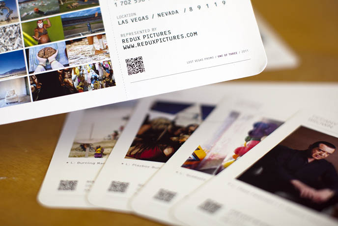
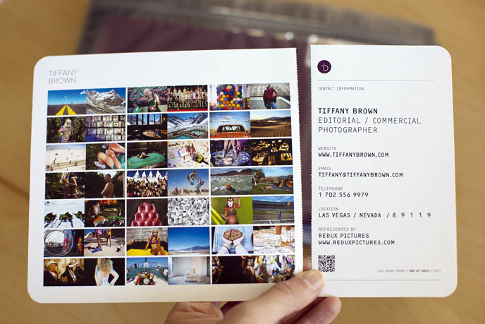
I get bombarded by photographers' mailers. Most of them are postcards or simple fold-out pieces. With so many hitting my desk, it's hard to tell them apart. Honestly, most go straight to the recycling bin. The ones that really stand out? They have a killer image that just begs to be stared at.

I love when photographers pick an interesting topic and then deliver a photographic narrative around that. The more interesting the topic, the better. Rather than just sending beautiful shots from a scenic coastline, they're actually digging in and telling a story through their shots and showing many different sides of their skill sets along the way. It shows creativity and the ability to tell a story through the lens. Those kinds of pieces get passed around the creative department the most.

[nggallery id=2]

One photographer who always sends beautiful, well designed mailers is Dana Neibert. He sent an incredible book a while back, printed on very tactile paper with hand stitched binding.

Dana designed his book himself. Printed by Neyenesch in San Diego. Quantity 7,500 (!)

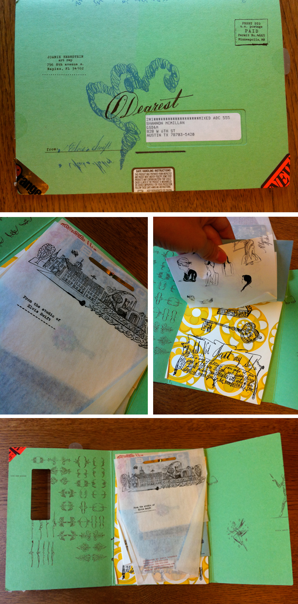
Jon Setzen, Creative Director, Something Massive LA

The best promo pieces for me are always the most simple. When you get numerous promo pieces a week the last thing you want to do is follow instructions to see a photographer's work. I once had to do a paint by numbers sort of exercise to see a photograph of NYC at dusk. I also never understood the corporate gift sort of promos - matchbooks, calendars etc. I understand why it's nice to have something to use and reuse, but for me I only ever saved things I thought were well designed. Recently I have kept promos from Amanda Marsalis (samples of newest promo below), Jim Franco and Kang Kim.

[nggallery id=5]

I always open envelopes and when you have to open an envelope your attention is always fully given to what is inside. When sending out my own promo pieces in the past I've always hand-written the addresses. People will generally open a hand-written envelope before a machine printed one. If you put a postcard with a short hand-written note in an envelope, it will get looked at and read. I would argue that your website (which hopefully appears prominently on the back of the card) will most likely be visited.

This definitely requires more work, but it's better to spend the time writing the note and addressing the envelope then it is trying to figure out which photo will look best on the mass-produced journal you're thinking about sending out. Work with a designer to think about layout and typography on the back of your card. If you have a logo (which you really should) have a custom stamp made and use that as your return address. Custom stamps cost about $30. It makes you look organized and invested in yourself and your brand.

Blair Thompson, Creative Director, Believe in

Being in the position of hiring photographers for projects, I am contacted fairly regularly. This can manifest itself in many forms. No particular medium has a better chance of attracting my attention. The main, and most obvious, distinction between those that succeed and those that fail is that they understand our visual direction and approach. We should be targeted because the photographer feels there is a 'good fit' and that their creativity 'mirrors' ours. Failing to understand this and subjecting me to irrelevant and unconsidered marketing is wasting both or time and money.

Ultimately we are most impressed by the work. That speaks loudest. Your capabilities and experience are all important but nothing speaks more loudly that the pictures! How it is presented is not necessarily the issue as long as it is confident and resonates with us. Usually this is most likely if the photographer is creative and resourceful and is not afraid to take risks — much like ourselves.

Focusing on particular mediums of delivery — here are my thoughts:

Digital Brilliant on the side of the photographer in terms of tracking and monitoring click throughs etc. But easy on the side of the recipient to ignore or intend to revisit — and never does. This approach requires considered design and imagery, working in harmony to cut above the sheer level of mail an average recipient gets on a daily basis and create an impression. Clicking through is step one. Having a site which then fully satisfies the users interest is what will make the biggest difference of all.

I am also a fan of the 'this is what I've been up to' email route. It's honest and allows the recipient to feel a privileged view into the photographers world. A bit like a blog but less frequent and again highly considered. It definitely provides a strong opportunity for building positive brand awareness. Don't overdo it though — there are still limits which border on annoying. About every 6 weeks is good.

Print A simple and creative approach works best here. Don't spend fortunes on elaborate brochures. Go with something which is cost effective and easy to replace with newer or targeted content. Think about what your customer is likely to best respond to. Also think responsibly in terms of the materials you print on and the lifespan of your materials. Beautiful images and design will stand a greater chance of being retained for longer — or even passed on, which is ultimately what you are looking for.

General Show your best work and try not to show everything and anything. Focus on what you do best or what you want to do more of. You will appear confident and professional and more likely to command a decent fee as a result.

Contributor Bios

Sandy Boss Febbo is the Executive Art Producer at Carmichael Lynch in Minneapolis where she has produced for a great range of clients for over fourteen years. Sandy has a degree in Art History and English Literature. Her background includes time with the Minnesota State Arts Board and she has volunteered as a docent at the Walker Art Center for over fifteen years.

Elise Robins: Born and raised in the suburbs of Chicago Graduated from Illinois State University with a BA in Marketing Graduated from Depaul University with an MBA in Marketing Management Has worked in the advertising industry for about 18 years Currently lives in Seattle with her husband Interests are reading and travel

Blair Thomson is Creative Director of independent design and branding agency Believe in. Established in 1996 Believe in exist to articulate engaging, provocative and effective brand experiences driven by ideas and solid research. They push boundaries and exploit possibilities, working in partnership with ambitious clients to realize the full potential of their brands. Experience encompasses branding, identity, print, packaging, illustration, art direction, digital, advertising and environment.

Prentice Howe is the head visionary and trailblazer at Door Number 3 in Austin, responsible for leading the indie ad agency’s creative team while playing an integral part in the overall company operations. As Executive Creative Director, Prentice supervises all art direction and copywriting, while developing strategic campaigns that communicate a brand’s truth to a desired audience.

Jon Setzen is the Creative Director of Something Massive, an interactive advertising agency with offices in LA, NYC and Buenos Aires. His personal work has appeared in numerous magazines, blogs and rock posters have been exhibited worldwide including London, Tokyo, Copenhagen, NYC and LA. He lives and works in Los Angeles where he also runs the Los Angeles chapter of Creative Mornings.

Self-Promo Round Table - Part 2 of 3

Today's self-promo round table panelists are from the entertainment industry:

If you missed yesterday's post from the editorial/magazine world, please check it out.

Wednesday I'll post feedback from ad agency creatives.

Leah Overstreet, Photography Director, Spike TV

I work at a guy’s network, so its great when promos come in that are geared toward the type of work we are doing. I make sure and hold onto these for reference for upcoming shoots that we have. Its very important to make sure and tailor your work towards your client and the type of work they are doing.

I receive so many emails each day and lots of times email promos get lost in the shuffle. If you send me a promo through the mail, I am 10 times more likely to see it and hold onto it, then an email.

scottmcdermott

scottmcdermott

I love this promo by Scott McDermott because it is not a pretty portrait. It shows all of the grit and imperfections in the skin, face, and hands. The contrast of the black and white backgrounds really make it stand out. It's a 6 x 8.5" card and is printed on thicker stock paper.

I also really like a recent promo I received from EJ Camp. It is 6x8.5. This promo is made of a thicker stock paper, with a photo finish. Its a great advertising shot and right in line with the work that we do. It made me want to look at her website and see more of what she does. I usually think that one or two images per promo card should be the max, however I think this is a good example of a series that works well using more images.

ejcamp2

ejcamp2

Put your strongest work on your promo that will drive the potential client to your site.

Maggie Fost, Art Director, Merge Records

I am more likely to keep a single postcard than anything more elaborate because if it's an inspiring image or something that just makes me smile, I'll pin it up on my bulletin board, which spans a full wall of my office and is filled with all kinds of images and objects. That said, an email that is specifically written to me (rather than crafted for mass distribution) is probably the most compelling kind of promotion. Knowing that someone is eager to work with Merge makes me more likely to file their email in my "photographers" folder than someone sending images of their recent work every quarter. If they include their location in the subject line, it's easier for me to find when I go back looking for a photographer in a certain city or region.

Another way I learn about photographers is by asking someone whose business it is to be in the know, like Jasmine (this is the straight dope - she did not ask me to say this!) For a recent project, I needed an L.A.-based photographer who had a sun-drenched dreamy style. Rather than googling away or sifting through my e-archives, I sent a quick email to Jasmine and she pointed me directly to the perfect person. It turns out this photographer had sent me promos in the past, but I ignored them because they weren't relevant to my needs at the time.

I also learn of photographers through our bands. If they want to work with someone specific for promotional shots or an album cover, we almost always honor that. If I like the results, we are likely to use that photographer again, so making connections with the subjects photographers are interested in shooting is just as important as marketing to the client.

Gail Marowitz, Creative Director, Roadrunner Records

The promos that I tend to keep are of two types:

The first promo has an image that directly speaks to what I do and my needs as a creative director for a Rock Music record label. It can have a portrait of a band in an interesting location, it can have a musician that looks comfortable and that properly telegraphs the sensibility of the recording artist. It can also be a still life or an illustrated photo collage that is dark, edgy and well executed.

The other promos that I keep are those of the extremely well designed nature. They have beautiful typography, interesting paper selection and are conceptually solid. These are the promos that assure me that the photographer has a good eye and cares about his/her work from concept to final output.

I do have pet peeves.

  • Do a little homework before blindly sending promos. If you send me still lifes of lipstick and flowers or women doing yoga, or children or beautiful fashion models, I will delete and/or throw away and not go to your website. I work for a Rock/Heavy Metal label. Try to send me appropriate work for what I do.

  • If you still go the snail mail route, make sure your promo is well designed and printed well.

  • Don't send me an email promo every week. I know there is a way for you to check if I found your promo interesting enough to look at your website. If I haven't checked your site, and you keep sending me promos (I receive approximately 20 of them a DAY), I will get annoyed. You don't want that.

What I appreciate the MOST, is when I meet a photographer who is talented, look at their book, explain my needs and in the following week or two, they have put together and sent me a body of work that captures the essence of what we talked about in our meeting.

Simon Keeping, Art Director, Kraken Opus

I receive a fair few printed promos from photographers. Its always nice to look at but in terms of referring back to them later I'm not sure I actually do. In the course of the publishing projects I work on there's alot of paper on my desk, flatplans, editorial plans, proofs, print samples etc etc so I normally lose them within that pile of paper or failing that it gets 'filed' somewhere safe which I then forget about.

I much prefer e-promo's which are easily forwarded to editors (when it comes to commissioning), other team members or even fellow designers and most of which I think represent photographers better than a printed flyer as the quality of the images is never compromised by poor printing.

One thing I find very irritating is when I take the time to click through to a site to check out a photographers work it can be at times a battle to just look at the images. A word of advice, If you direct me to your site, I don't want to see loads of flash animation and over designed navigation, I want to see the quality of your work. Keep your site clean and functional other wise people will just get frustrated and give up trying to view your work. Remember what the function of your site is: a tool for art directors (very busy people) to see your photography. I'd rather see the worlds most basic website which allowed me to quickly view your work and get a feel for your style (with easy to find up-to-date contact details) than an all singing, all dancing web extravaganza. Remember your site is often the first point of contact with clients, don't miss out on work because of it!

Contributor Bios

Gail Marowitz has been art directing and designing for the music business for nearly twenty years. She has worked for various labels including Tommy Boy Records, the Imago Recording Company, Wind-Up Records and Columbia Records where she was the Design Director for ten years collaborating with artists such as James Taylor, Patti Smith and Bette Midler. In 2006, she won a Grammy® Award for "Best Recording Package" for Aimee Mann's "The Forgotten Arm" and was nominated in the same category again in 2008 for Mann's latest release "@#%&*! Smilers". Her work has been selected for Print Magazine's Regional Design Annual and she was a recipient of a Silver Telly Award in 2008. Currently, she is the Creative Director at Roadrunner Records, a label whose stock in trade is mostly hard rock and heavy metal. You can see her personal work at www.thevisualstrategist.com

Maggie Fost is the Art Director at Merge Records, an independent record label in Durham, North Carolina.

Leah Overstreet began her career photographing for the Smithsonian National Zoo in DC. After moving to New York she worked in the photo departments of GQ, Vogue, and Men’s Journal Magazines. Leah is currently the photo director for Spike TV/TV Land and a freelance photographer.

Simon Keeping is a freelance art director, currently working with Kraken Opus who specialize in high end, limited edition books. He has recently art directed 5 titles for such luminaries as Ferrari, Deigo Maradona and Tottenham Hotspur. Influenced by music, design, illustration, fashion, photography and reading too many skateboard magazines as a teenager, he describes his style of work as ‘clean, stylish and bold’.

Self-Promo Likes (and Pet Peeves)... From the People You're Sending Them To (Part 1 of 3)

1.png

Just to drive everyone nuts, I've been talking to photo editors and creative directors about what sort of promos they like enough to keep. As you hopefully know, most of the print promos they receive go straight into the recycling bin (and most e-promos aren't opened). What makes a promo stand out enough to get pinned up on the wall of chosen ones? What promos get forwarded to the other creatives? What turns people off?d And why should this drive you nuts? Well, as with anything creative, it's highly subjective. Ask 5 different people, get 5 different answers. That said, there are some common themes throughout. Everyone agrees that overly gimmicky promos can't make up for mediocre images. There's also some consensus that personal project images make the more interesting promos.

Over the next three days I'll be posting creatives' thoughts. Today's installment is magazine photo editors. Tomorrow check back for opinions from the entertainment industry (record labels, TV and book publishers). Wednesday will feature ad agency creatives.

Today's panel:

Rebecca Crumley, Director of Photography, The Knot "I’ll peek at the promos as I walk from my mailbox to my desk. But honestly, 99% of the time, they go straight to the recycling bin. I’d rather see an updated blog to convey the current work. This way, I know a photographer is actively shooting, staying on top of their business, and get a better sense of his or her personality. I also work in a different manner than most photo editors; I’m seeking existing images from which we’ll produce editorial content. So this ties into taking time to send promos to creative professionals of relevance to your work and of applicable needs."

Sacha Lecca, Senior Photo Editor, Rolling Stone

[nggallery id=1]

DSREPS late last year (i think) sent out a large oversized set of images by Deborah Schwartz's amazing roster of talent (see pictures of the promo in action). It certainly made an impression getting such a large set of promos. My favorite in the bunch: Fucking Flies On My Wedding Day by Jason Nocito. www.dsreps.com | www.jasonnocito.com

Cole Barash is a photographer whose work I've been checking out for a few years. The promo card itself is very simple. Simply designed promos stand out to me where logos, slogans, unnecessary graphics on a promo card can distract. I was able to work with Cole this year when he shot surfer Clay Marzo for us, which was great. www.colebarash.com

Mark Murrmann's day job is photo editor of Mother Jones magazine and he  is also a talented photographer. We sort of got introduced recently and he sent me his card. His live music work is great. www.markmurrmann.com

Giant Artists very recently sent out a beautifully printed book showcasing the artists they represent. I'm a big fan of Giant Artists and their roster so this is an obvious keeper. www.giantartists.com

...speaking of printed books, pamphlets or zines, Phil Jackson, is a documentary photographer out of Philly largely shooting his fellow skaters, every once in a while puts out a small zine. www.philjacksonphoto.com

...also, just this week I got a booklet by Eric Kayne featuring his work on the band Arcade Fire (-ed. note of full disclosure: I produced this promo). I like the pics though some of the design elements take away from some of the shots. (ie the white vertical lines cutting into them.) (-ed. note: fair enough!) www.erickayne.com

Alex Lake/Stem Agency: I met with a rep from Stem Agency and this card was one of their leave behinds, a photo by Alex Lake of Florence Welsh of Florence and the Machine. It's such a gorgeous image feeling more like a cinematic film still. www.stemagency.com

Brenda Milis, Director of Photography, Men's Health

I very much like to get promos in the mail since I check each piece of mail every day. I am much more likely to miss emails: I may open an email and get a call or have someone walk into my office and completely forget about it, having never truly looked at it. That promo mailer, in contrast, is sitting right in front of me on my desk. I feel very strongly that not a lot of money needs to go into making a good, impactful photo promotion. I think it’s important to include more than one (and hopefully several) images in your promo, be that on one card or several pieces/cards. If it’s just one great shot I might not get as strong of a sense of your shooting style, your range, and in fact you may have just gotten lucky shooting one great image!

I am really turned off by overly clever, overly produced promos that I receive (and more about that in my discussion of promo 2, below). Please have the confidence in your images to let them speak for themselves. I don’t need to make a keychain out of your promos, nor a luggage tag for that matter. Also, I really want to be able to recycle your entire promo if and when I get rid of it. I don’t want a lot of plastics and doo dads that are bad for the environment and add to waste. Our industry is wasteful enough as it is.

1. Angie Smith Was not aware of Angie’s work until I got this promo book which is in the form of a notebook. It’s lovely and clearly wasn’t inexpensive to produce. Redux reps her and produced the promo. If Angie had sent me a single card with 3 or 4 images on it, I would have been just as happy.

Designer: http://silasdilworth.com/

Printer: Paperchase.net

2. Joseph Escamilla Wow -- I almost never took the time to open this promo. It’s a good example of overdoing it: This came as a package in a clear plastic wrapping. It was hard to make out the images because of the stuff that was attached to the images themselves. The base of package was the anatomical head figure, mostly covered with what looked like key chain tags.

The promo card was part of the package as well. The star of this promo was the stuff included which basically obscured the images which I really quite like. Very intriguing and unique imagery of artifacts which we may be able to use for stories about medically-related topics, etc.

In sum, a very annoying promo that I’m glad I took the time to open and unpack in order to see the photos. I wish that the photographer had just sent me promo cards -- would have been happier and he could have saved a lot of money.

Promo Specs:

The promo was a collaboration between Rachel Ma (helloraye.com) and Joseph, with prior identity and branding having been done by Owen Gee (nicelyobserved.com). Most of the components were straight out of office supply stores, all the printed material was done in small 500 print runs by uprinting.com. 5 4x6 4/4 offset postcards.  And 100 8x10 digital prints.  Everything else such as labels and personal notes were all done on his laser printer. Joseph created 100 promos and have mailed about 40.

3. Dorothy Hong Dorothy Hong's promo cards show an intimacy, a freshness, and youthfulness that is lovely and I'm looking for the right assignment for her. She sent me a packet with 3 cards, each one had one image on it.

Promo Specs:

Designer: Dorothy designed them herself with a template she created years ago, just dropping in new photos each time Printer: overnightprints.com Print run: 1,000 total (4 different photos, single sided 4x6 postcards, 250 each) Distribution List: Mailed all 4 out in 1 envelope, to 250 people. So every envelope contained 4 separate, different photos. 4. Hollis Bennett This is a simple tri-fold mailer promo with three images on the inside and his name, website, contact info on the back. Gorgeous, medium format pix---could use for travel, documentary. Simultaneously lovely (which makes me happy) and yet appropriate for a men's mag (which makes me happy).

Promo Specs:

5,000+ emails 6 times a year through Agency Access Designed by Hollis and printed by Nashville-based Jive! printers. Print run around 350 tri-fold cards.

Molly Roberts, Director of Photography, Smithsonian

IMG_0849(2)

IMG_0849(2)

I live with photographer promos surrounding me and keeping me company during my work day. I recently changed my wall and posted an image by Alex Masi. Prompted by his postcard to check out his work, I found out that he had photographed the Buddhas of Bamiyan earlier and was heading back to that area. This led to my assigning Alex for a feature in the December 2010 issue of Smithsonian.

Although I love having some of these postcards and prints around me, I also lament the waste as over 70 % probably end up in the recycling bin. I prefer digital mailers at this point for conservation purposes.

Allyson Torrisi, Director of Photography, Popular Mechanics "I think the simpler the promo the better. I have a prejudice that the more elaborate the promo , the more it is to make up for talent. Great talent will stand out on a single postcard with two images. The goal is to drive me to your website to see your work. It is more important to to have great work. Invest your time and energy into test shots, collaborating with friends. Shoot a personal story, that tells me more about who you are than a vellum envelope."

Contributor Bios

Rebecca Crumley is one of the industry's leading experts in wedding photography and style. In her role as Weddings Photo Director at The Knot, she is responsible for producing hundreds of Real Wedding stories featured each year in The Knot Inc. media properties through managing thousands of wedding photography submissions. Her daily interaction with photography also predicts trend forecasting and industry insight.

Sacha Lecca is a Senior Photo Editor at Rolling Stone, with over 16 years' experience in magazine publishing, including stints at Newsweek and CMP Media.

Brenda Milis began working with photography as an art historian, receiving her B.A. at UC Berkeley and studying photo history on fellowship in the graduate division of Northwestern University. Getting her start in photo editing at Jane magazine, Brenda eventually helped launch Style.com, then moved to Santa Fe, NM to work as a photo editor at Outside magazine. She is currently the Director of Photography at Men's Health magazine. Shoots she has produced have won awards and been featured in American Photography, SPD and the PDN photo annual.

Molly Roberts has been working in the newspaper and magazine biz for 30 years. She is  currently Photography Editor at Smithsonian Magazine.

For more inspiration, feedback and contradictory opinions about self promos, check out these resources:

Rob Haggart's APhotoEditor.com archive is a treasure trove of self-promo write ups.

PDN hosts an annual self-promo contest. You can browse the winners galleries by year for lots of inspiration and some ideas for graphic designers and printers to contact (when that info is listed which it isn't always...)

The No Plastic Sleeves blog is all about great promos and portfolios. Tons of inspiration.

Teaser: Self Promo Roundtable in 3 Parts

A little teaser for the weekend. On Monday I'll be posting the first of three installments of interviews with various creatives who receive a lot of self promo pieces. We'll be talking about their likes, dislikes and major pet peeves. E-promos vs. print. Envelope vs. no envelope. Simple vs. complex. You'll read candidly honest opinions from:

...plus maybe a few more.

I'll also be featuring galleries showing specific examples of promos people loved enough to keep.

See you here on Monday!

iPad Portfolio vs Printed Portfolio

Over at APhotoEditor.com, creatives are weighing in on if print portfolios still matter. Like with almost anything related to marketing yourself as a photographer, ask three people and you get three different answers. One person says yes you have to still have a print book, another says they haven't called in a print book in over a year. The one thing they all agree on: be prepared for any situation. My question isn't so much about having a print book vs not having one. I wonder more -- if you're going all digital -- what are you showing on your iPad that can't be shown online? What experience are you giving the creative that she can't get by just going to your website?

Consider this. If you're dropping off/shipping your iPad: Just like print portfolios, they have to be delivered, where they take up room on the creative's desk, and then the person has to take time to make sure they get returned to the messenger center or mail room.

If you're looking for an in-person meeting, are you delivering a richer experience on your iPad than they could get by going to your website? I can't tell you how many times I've had to tell photographers that rolling up to a meeting just to show off your website or some folders of images on your desktop is not going to cut it. Aside from the novelty of having someone flick through your on-screen portfolio, are you offering much more than your website does?

Don't get me wrong, I think the iPad is iRad, I just don't want photographers to abandon the process of making print portfolios if they end of doing themselves a disservice by annoying a potential hirer.

I'm sure there are some fab examples out there of killer iPad portfolios and I want to see them! :)

Goodbye magazines, hello crowd funding?

Long gone are the days when photographers could pitch a great story idea to a magazine and get a guarantee or a nice long assignment. It does still happen, especially with unique ideas that are topical, timely or controversial, but it's the exception to the rule. Crowd sourcing, and specifically "crowd funding", could be the new model to getting those stories produced. Photographers, journalists, artists and other creatives are tapping the buying power of their social networks to make their projects a reality. Through web sites like Kickstarter.com and ProjectSite.com, photographers pitch their stories to the world, raise money and hit the road.

Journalist Erin Siegal has raised over $3,000 to cover her expenses in Guatemala as she completes a two year long investigative journalism piece on corruption in the adoption industry.

Photographer Zoe Strauss has raised $4,000 to do a series on how the BP oil spill is affecting people in The Gulf.

Stan Engelbrecht and Nic Grobler have raised over $16,000 to turn their project on South Africans and their bikes into a photo book.

The great thing about this is you instantly have a built in network of people who care about your story. All those small donations add up and those people will follow your progress, tweet about it and post about it to Facebook. It's like having hundreds of people doing PR for you.

Another big plus is that once you are done with the story, you can take it to book publishers, magazines, gallerists and art buyers and show them, in a concrete way, just how dedicated you are to your craft. Telling someone you have a great project idea is one thing, showing them is another.

Lastly, putting your ideas together and preparing them for one of these funding sites will force you to really think through your project. You might just find, through a lack donations, that it's not the great idea you originally thought it was.

UPDATE: PDN just posted a very informative interview with Yancey Strickler, co-founder of the crowd-funding Web site Kickstarter. It include tips on why some projects exceed their fundraising goals while others don't bring in any money.