Q&A with GSD&M Senior Art Producer Shannon McMillan

Shannon, thank you for taking the time to share your opinions about self-promotion with the photographers and illustrators who read this blog. Can you start by describing a typical day for you at GSD&M?

Every day at GSD&M is different, which is nice because it keeps the work-life scenario interesting. Production is hectic, fun, stressful, an adrenaline rush, and a love/hate relationship. There is definitely never a dull moment!

Shannon McMillan's Office at GSD&M

Each job is a different can of worms but, you learn something new every time. I spend most of my days answering emails, putting together bids, submitting estimates, negotiating with reps or photographers, doing stock searches, chasing down creatives, and looking at Good & Not-So-Good work. However, there are some days that I'm not at my desk due to meetings, which is a challenge,  because you still have to find the time to squeeze in all the administration required for the entire business. Keeping a list of "To-Do's" really helps me keep it all check because otherwise the small details can get missed. The best part of my job is that I do have days when I DO spend all day searching for hot new talent. I have a long list of photographers categorized by Conceptual, Fashion, Lifestyle, Portraits, Landscape, etc., but I'm always on the look-out for additions to the list. My job is challenging, frustrating, detail-oriented, and ultimately rewarding... I love it!

How many unsolicited emails do you get every week from photographers?

I probably get about 50 emails a day.

How do you handle all of those? Do you bookmark any sites because of them?

If an image or two pops up, I do take the time to review. If I like the work I do bookmark the work. If the email has a long drawn out message + a link, I'll either quickly click the link or just delete it. I do like to give everyone an opportunity but some days I'm just way too busy to read and review the work.

elvis_swift
elvis_swift

How many print promos do you get each week?  How does that compare to a couple of years ago?

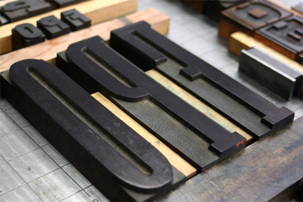
It's a joke how much mail I still receive and toss out. Let's just say sometimes the mailroom has to bring me my mail in a box. Compared to a couple of years ago,  I feel it hasn't changed much except that I've noticed promos aren't as elaborate. I'm seeing more posters, larger postcards with multiple images and accordion style promos.

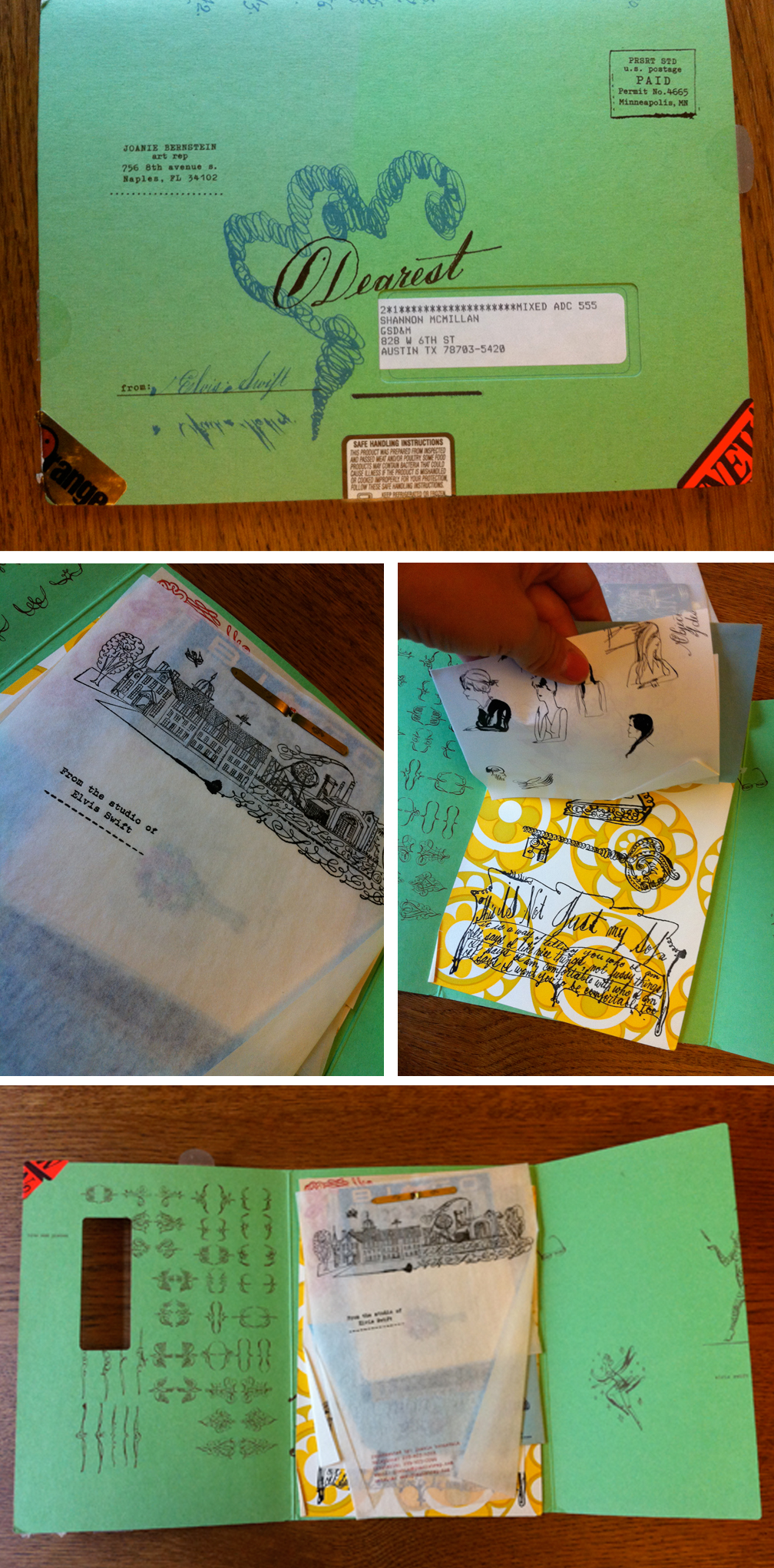
Most of the samples of promos you gave me that you liked feel more special and custom. How do you respond to the more simple postcard promos?

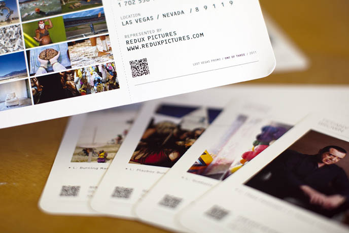
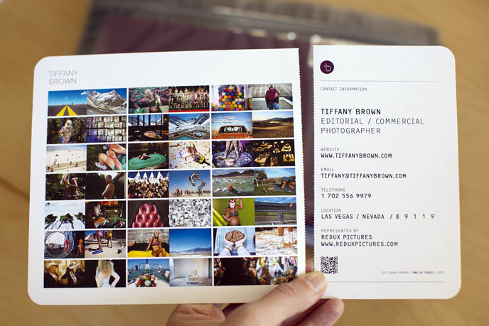
Most of the time the single picture postcards end up in the trash, unless the subject is interesting, unique or funny and it's just a damn good shot. I like to be inspired and intrigued. The postcards with multiple images can give you a better idea on the quality of the work. I also feel sometimes the one picture postcards end up being a 'one hit wonder'. (see examples of single postcards in gallery at bottom of page)

Which format, print or email promos, do you prefer?

I still like both. Some of the promos I see as an art piece. I love when a promo is a well designed cohesive piece (paper, design, 3+ images). Oh, and I LOVE the coffee table books!

buck_isnt
buck_isnt

How do you feel about unconventional or gimmicky promos: boxes of candy, matches, treasure hunt maps, ransom letters, etc.  These seem to be very popular lately because they have the potential to garner a lot of attention on blogs. But do they really make a better impression with you than simpler printed promos?

The gimmicky promos do get my attention but doesn't necessarily convince me to save the work.

christian_weber
christian_weber

If you could change one thing about the way photographers reach out to you, what would it be?

Limit the number of times you send emails per month. I get emails from the same group of reps/photographers every week to every two weeks. I think once a month to every 3 months is sufficient. When emails start to come every week, I just end up deleting and not taking the time.

What are some of your favorite ways to learn about new photographers?

I think what Wonderful Machine is a great idea for agencies and photographers. I also recently sourced AtEdge, FoundFolios, PDN and we sent a group to LeBook.

kretschmer
kretschmer

I know you have participated in portfolio reviews in the past. do you think those are a good investment for photographers? Have you formed any new relationships with photographers because of them?

I really do think the reviews are a good investment. I personally try to be honest and provide constructive criticism. I've kept in touch with several photographers and continue to provide feedback. I want to helpphotographers grow and further their career.


Shannon McMillan_head

During her 14 years in Advertising Shannon McMillan has worked as an Art Producer with worldwide clients (BMW, Kohler, Brinker, The US Air Force, Southwest Airlines, AT&T, AARP, Harrah's, and others), talented photographers and production teams, and reviewed hundreds of portfolios, websites and promos. She has been a juror for panels such as: PDN’s PIX, PDN’s Photo Annual, and the Palm Springs Photo Festival. She enjoys the sense of satisfaction and accomplishment that comes creative power and strives to maintain her artistic integrity. Photography is her personal passion and she looks forward to any opportunity to create.

Case Study: Kainaz Amaria

amaria_promo_image.jpg

Kainaz Amaria needed help focusing her website and print portfolio edits to better convey the kind of work she wants to be known for. We talked about her style and where she wants to see her business go in the next couple of years. Then we got to work re-editing all of her images. We created new, more streamlined galleries on her site and built a print portfolio that reflected the changes.

After we completed the editing, we worked on print promo concepts. We knew we wanted to be able to show a variety of images and make a great first impression. Originally, we had a stack of 6 promo cards in a custom slip case printed in India. Unfortunately, the quality of the printing wasn't up to par and we had to start over. San Diego-based Modern Postcard came to the rescue with a custom printing solution that worked with Kainaz's budget. In the end, we modified the original idea to create one card that folds out. The card is 6x9 inches when folded, and folds out to 6x27 inches. Each panel is perforated so that clients can keep just one image if they want to.

Kainaz included a personal letter of introduction and her signature, and hand addressed all of her envelopes. I think it lends a very personal touch.


Tiffany Brown Marketing Campaign

spring_promo04.jpg
spring_promo03
spring_promo03

Las Vegas-based Tiffany Brown needed a marketing campaign that would announce her move from staff newspaper photographer to the freelance editorial and commercial market. Since Las Vegas is such a travel destination, we decided on a campaign built around the theme of boarding passes. With designer de-mo.org, we created a stunning promo consisting of 6 "boarding passes" sent out in a zip-sealed Mylar bag. We also created a print giveaway promotion and a coordinated email promo.

Read more about Tiffany's rebranding process on her blog.

Free Portfolio (or book, personal project or website) Reviews for Recent Photo Grads

This August I'll be doing 5 free portfolio, website, personal project or book dummy reviews for recent photography program graduates. Why? Because August is slow and recent grads are broke. Interested? Email me (info at jasminedefoore dot com) the following info: - Your name

- Your website if you have one

- Where you went to school and your date of graduation

- What you want me to review (a print portfolio, website portfolio, personal project or book dummy)

- A personal statement about you, your work, why I should look at it, etc

I'll be in touch with the 'winners' the first week of July to share details of what I need from you.

Happy Summer, Jasmine

Photo Editor Maggie Soladay Critiques Unconventional Promos

Unconventional promos -- boxes full of toys, food, elaborate scavenger hunts, etc -- are getting a lot of attention these days. Despite the fact that a lot of art buyers and editors say they prefer simple promos, photographers are still churning out these pricey and attention-grabbing promos. Lately, it seems blogging about the promo sometimes gets more attention that the promo itself (Clint Davis and Casey Templeton come to mind). I like that people are documenting the process and sharing the promos in so many ways. Seeing a video of someone's promo go viral makes all the work, and often expense, more worth it.

When planning to do a promo like these, you need to really think about who your target market is and if it's worth the time and expense to reach them. You may be more effective doing something less expensive. Obviously the scale of these promos means they are not being sent to huge lists, so working on a really tight list of existing clients you love and dream clients you want to love you is key to making the most of your marketing dollar.

Below are Maggie's critiques of a few "out of the box" promos she has received recently.

Michel Leroy http://www.michelleroyphoto.com/ New York, NY What: 4 oranges and a promo card. Oranges are a great gift and they were a good tie-in back to photo on the promo card.  The package colors, imagery, theme and design were all in-sync with each other.  The promo card is a commercial/editorial portrait that is professional and a little weird (who bites into an orange?). It is different enough to grab my attention but not so weird as to confuse me.


Eric Schwabel http://schwabelstudio.com/ Los Angeles, CA What: Create-A-Face game. Peal and stick (re-stickable) photo decals to place on the face of a dude and build different (slightly frightening) characters. This was designed to impress creative directors and art buyers and I bet it will! I can imagine it was quite pricey to produce. But Eric thinks big and different. And, I think this is an unforgettable promo for tough to impress art buyers and ad agency creatives. For editorial, I think this might work with major newsstand publications but is slightly wasted on a business magazine photo editor like me.


Tony Gale http://www.tonygale.com New York, NY What: Remote control monster truck, ransom note, and promo card. The ransom note said that; in order to get the controller for the car, I need to make an appointment to see Tony’s new book.  I have heard he is getting a great response.  He has an all new website and this is his best promo card so far.  My main complaint with this promo is that the red monster truck toy has nothing to do with his work, his subjects or the enclosed promo card and ransom note.


Wayne Brezinka (illustrator) http://www.brezinkadesign.com/ Nashville, TN What: 45 rpm coaster and a promo card. So cool I had to pick include an illustrator.  When you go to his site the postcard image is top of page.  Everything ties in beautifully. I really liked this promo, Wayne’s work, and his website.  It’s a total coincidence that one of our art directors commissioned him the same week the promos arrived on their desks. (editor's note: also check out Matt Barnes' vinyl record themed promo)


Dave Moser http://davemoser.com/ Philadelphia, PA What: Custom Chocomize chocolate bar and two sets of promos. The first part of this promo was series of long elaborately branded cards. I almost didn’t notice that one of the long cards was a coupon for a free custom designed chocolate bar. Score! I designed a dark chocolate bar with toffee, peanuts, and sea salt. It is incredibly good. This sweet promo cost him a decent amount at $10. I don’t know if it will pay off for him with me because his style and subjects don’t mesh with the styles I hire for at my magazines. What does totally work for Dave is that I spent quality time on his site and I won’t forget his name (certainly not while there is still some chocolate left in my drawer).


Jen Judge http://www.jenjudge.com/ Santa Fe, NM What: Newspaper This mini newspaper has images and stories from her work in post-earthquake Haiti.  All of the images are black & white, incredibly simple, and totally effective on the paper stock.  I emailed her immediately, or maybe I called.  (I do that sometimes).  She told me that she just got the idea to print the newspaper and send it out.  She hadn’t ever really promoted her work before but this was important to her.  I love the idea. It works too because all the portraits are from the same project.


***

Are you one of the photographers' mentioned in this post (or have you done a similarly unconventional self promo piece)? It'd be great to hear from you about the response you've been getting, how much you spent on the promo and how you decided who to send them to.


Redux Pictures Magazine

reduxmagazine
reduxmagazine

Produced and edited a 36 page magazine highlighting some of the best work of four award-winning photo agencies. The theme was "Sustainable Industries" and featured stories ranging from renewable energy to organic farming, green jobs creation to eco-friendly building practices.

The magazine was sent to 2,000 creatives at graphic design firms, magazines and ad agencies as well as corporate marketing professionals.

Picture 13
Picture 13
Picture 12
Picture 12

Award-Winning Web Designers from this year's PDN Photo Annual

Every day people ask me if I know of any good web designers for portfolios. I usually point people to the more popular template products (aphotofolio.com, livebooks.com) and a handful of custom designers who seem to always be too busy to take on any new jobs. That's why I love the PDN Photo Annual Website section. It's a chance to check out a bunch of people I might not have heard of otherwise.

This year's winning websites were designed or coded by:

Lewis Carnegie (Austinite!) Jason Sherwin Noah Wall Hatch Design / Jay Meyers, TwinAct RAT / SMAUG (Italy) Canvas Group Aussie based design firm Mike Hartley Martin Fuchs (also winner of best company name): Shut Up I'm Awesome Toben another aussie shop Brian Hoff

A few of the websites were credited being designed or programmed by A Photo Folio. As far as I know, they don't do usually do custom work. If you buy a template from A Photo Folio, you are responsible for doing your own customization to make it look cool, and less like a template. I think the exception to that rule is if you are Dan Winters ;)

Happy clicking.

Faves from the 2011 PDN Photo Annual

It's that time of the year when you dig into the Photo Annual, remember all of the great work shot last year and discover some new gems along the way. But inevitably, a few months later I've forgotten some of these photographers so that's why I like to write it all down. Below are some of my favorites, in no particular order:

Advertising Nadav Kander's portraits for St John Ambulance campaign. Agency: BBH London Emiliano Granado's Converse campaign Jeremy & Claire Weiss's K-Swiss campaign. Agency: Adam&Co

Magazine/Editorial Peter Van Agtmael for The New York Times Magazine. Story: Jeff Bridges Christopher Griffith for Men's Health. Story: Contrasting images of youth and decay Robert Trachtenberg's hilarious nude group portrait of the cast of Jackass 3D inspired by Ritts' iconic supermodel shot Andreas Laszlo Konrath's black and white portrait of a model reading for New York Magazine Nigel Parry's portrait of Leonardo DiCaprio for Esquire. (Full disclosure: any portrait of Leonardo would end up in my best of list) Tierney Gearon's very young cheerleaders for ESPN, The Magazine

Books Nguan's self-published Shibuya Tim Hetherington's Infidel, published by Chris Boot Ltd. Eugene Richard's War is Personal Timothy Archibald explores learning to understand his son's autism in Echolilia/Sometimes I wonder

Photojournalism/Documentary Sarah Elliott's photograph of a Kenyan abortionist's "tools" Jana Romanova portrait from a series on sleeping couples who are expecting babies. Matt Eich's Baptist Town portrait for AARP Bulletin Ashley Gilbertson's "Bedrooms of the Fallen" project Darcy Padilla's amazing 18 year long documentary, "The Julie Project" Ben Lowy's BP Oil spill abstract seascapes for GQ

Personal Tim Gruber/Ackerman Gruber Images image from the series "The Island" Wayne Lawrence portrait series of people at Orchard Beach, aka "The Bronx Riviera" Magdalena Sole image of a baby on a porch, from "Cotton Land -- The Forgotten Mississippi Delta"

Matt Nager

Picture-103.png

I recently wrapped up work with Matt Nager. Matt is a very talented portrait and documentary photographer whose old website was obscuring a lot of his strongest work. We started by talking about his strengths, defining what his main goals were and establishing the best way to spend his marketing dollars to reach those goals. We completely overhauled the website, resulting in a fresh and streamlined site powered by aphotofolio.com. His previous site featured too many choices of stories for editors to go through, so the new site is all about delivering his best images efficiently so that busy editors don't miss the strongest work.

We also put together a print promo (quantity 750 printed by paperchase.net) announcing his upcoming move to Denver. The promo features images that highlight his strengths in portraiture, travel and documentary.

My personal favorite part of our project was developing the print portfolio (I just love print books!). Matt teamed up with the very talented Scott Mullenberg at portfoliodesignstudio.com.  Scott sent a variety of fabric samples for us to consider. We narrowed down the choices to a palette of blues and browns and finally decided on what you see below. I edited and sequenced Matt's work to highlight his diversity but also to show that he approaches all of his subjects with a consistent personal style and vision.

I am really happy with the finished product. Matt traveled to NYC and DC and got 23 meetings in just a little over a week. Upon returning home, Matt said "I think editors really liked having a physical book, it honestly made a huge difference." Many editors mentioned loving the colors as well. Actually showing your book to a lot of clients is the best way to gauge if the edit and sequence are right, and Matt might make a few tweaks to the book. But the overall impression was that "the sequencing was really great and showed off (his) versatility."

Of course now the real work begins... all of the follow up marketing that will help Matt capitalize on the the momentum we have built. To help with that, I created a year long marketing plan for him that incorporates suggestions for print promos, newsletters, social media and in person meetings.

Best of luck with the next year Matt!

Photo Editor Maggie Soladay Critiques a Week of Promos

Maggie Soladay (@maggiesoladay) generously shares critiques of print promos she receives. Here’s what she has to say about this week's batch:

1. Jonathan Robert Willis lives in Bellvue, Kentucky. I have been working with him for years as my go-to for Midwest portrait and lifestyle assignments.  Luckily, I know that Bellvue, Kentucky is the Cincinnati metro area.  His website and card don’t make that clear.  In fact, his card lists a NYC number.  The card is terrific and wild and I am guessing it’s aimed at advertising clients, which it should be.  Though, for an editorial photo editor that doesn’t know him I think it would be tough to identify his region without digging.  For example, he just shot an assignment for me this past month in Indianapolis, Indiana, a 1.5hr. drive from Cincinnati.  In this batch of promos his really stood out.  http://jonbob.com/

2. Brooklyn based Daniel Glazer’s card was meant to direct me to a video vignette of a model.  Not my interest area or work area. Totally not the kind of photography we use.  But, what Daniel shoots and how he shoots reminds me of why and how I got into photography in the first place. http://www.danielglazer.com

3. I want to love Van Ditthavong.  He has been sending promos for a while.  The current one has a bluish/cyan cast to it.  Not great. Van has a great environmental portrait series called “Portrait of the American Dream” in which he photographed immigrants on the job wearing popular culture kids Halloween masks.  I know him as Dallas based but the postcard and the website say Los Angeles and Dallas.  That always irks me. Who lives in more than one place? http://vanphotographs.com

4. Milwaukee photographer Adam Ryan Morris has a good identity design that is simple, memorable and fun. Strikes me it represents him well. And his photography is good. Only one problem: his website has a commercial section and that makes no sense.  He seems to have been much published in a couple of magazines, namely Milwaukee Magazine and that’s great.  But I don’t see how the other work is or can be called commercial work? Confusing.  A fun charming image on the postcard totally caught my interest and I remember him from previous similarly fun promo cards in the past year.  http://adamryanmorris.com/

5. Knoxville, Tennessee’s Hollis Bennett is a great photographer with a sleepy promo card. The 3 images on his card are too dark and not very engaging.  The work on his website on the other hand is fantastic.  I could spend a lot more time there.  Few photographers have the ability to give a sense of place to a story like he does.  Hollis is the discovery of the week!  Great work, great subjects, and totally original eye.  If I wasn’t going to write about the promos I may not have ever visited the website due to the promo card alone.  I am glad I did. http://www.hollisbennett.com/

(editor's note: number 6 was removed per photographer's request)

7. Michael Murphree’s card has a very straight picture of Cameron Diaz on a grey background. He included an 866 number and his URL but nothing else- no location, email, greeting or photo caption. I need to know where someone is located because I am a magazine photo editor and, like many, I haven’t seen a travel budget in years.  I assumed Los Angeles and was correct. Where else would a picture of a celebrity be promotion enough?  Some great work in the “human interest” section and some shots on grey of all of our favorite comedians. http://www.michaelmurphree.com/

***

I think Maggie's feedback is spot on. Especially:

- Know who you are targeting to and try to send an image that is relevant to what they do (my exception to that rule is when you are sharing personal work. I think it's ok to share something that is not totally relevant when your goal is to give the editor a better sense of who you are and what you are passionate about).

- Make it easy for the editor to know where you are based. Although photographers do sometimes get sent to other locations for assignments, for the most part, photo editors are looking for great regional photographers.

- Be mindful of the quality of your paper and reproduction

***

Check back next week when Maggie highlights some of the quirkier promos she receives (think box of oranges, remote control car, etc). 


New York Photo Festival Awards - Deadline and Tips

6pm EST is the new deadline to enter the New York Photo Festival Awards.

The 2011 edition of The New York Photo Awards features twelve category winners - including best fine art single, fine art series, documentary single, documentary series, advertising single, advertising series and photo book - one of whom will be selected for the Jury's Choice Prize, a $5,000 cash prize for best overall picture or series, presented by Persol.

As a former judge (2009) I'd like to share a few tips for preparing your entry. Of course judging is highly subjective and what each person will respond to is unique, but here are some basics to help you put together a good entry.

  • Know your judges (complete list here). Judging is highly subjective but being aware of the background and current job of each juror will give you some insight into where they are coming from.
  • If entering a single image, make sure you are choosing a truly unique and memorable image that will not elicit groans of "seen that before". There are so many visual cliches (check out Mike Davis' awesome blog post about avoiding cliche). Ask yourself the tough question: Is this really an original image? Am I offering the judges and public something they haven't seen before?
  • If entering a series, make sure your edit is TIGHT. Be ruthless with your editing. Show your edit to a few other people who will be honest with you. Photographers I work with almost always hold on to images they don't need. They have a personal connection to the image, or the moment in which it was made, that keeps them from being able to let it go. The judges are going to have a better impression of your work if they are left wanting to see more.
  • Make sure each image in your series offers something new and interesting to what you are saying. Often there is too much redundancy in people's contest edits. You aren't necessarily telling the whole story when you enter a contest. You are trying to put together an edit that will stand out with the judges and be memorable.

Remember, the judges will be looking at a lot of images. Do them a favor by showing work that is fresh, interesting, poignant, emotional, raw, subtle and unique.  Sounds easy, right?


Chris, Tim


I feel ill-equipped to add much to the many poignant, heartfelt and eloquently written memorials others have posted for Chris and Tim. Yet, if I don't get something down on paper now, I know I will forget how I'm feeling, and forget the details of the horrible week when Chris Hondros and Tim Hetherington were killed while covering the fighting in Misrata, Libya.

Like so many others, I was shocked and sickened by the news. I remember reading that first tweet Wednesday morning and calling Jay at work. Surely it couldn't be true. Then following the thread back to facebook where the news first broke. I was sickened to think of Chris and Tim's families getting this news the way the rest of us were. As Teru Kuwayama so eloquently wrote, the social media world does not have the same rules as the military when it comes to announcing when someone was killed in action. We are navigating new waters. Maybe there was no better alternative. Maybe the news needed to be spread quickly to ensure that Chris and Tim's bodies would get out of Misrata quickly. But still, it felt so wrong.

My other first reaction was "not again." Are the journalists who give up their lives to tell important stories really helping? Are people's minds really changed? Does public policy change? Of course I want to believe it does. Again, someone else explained how I was feeling better than I could myself. Thank you David Alan Harvey.

I remember discovering my dad's copy of Philip Jones Griffith's Vietnam, Inc. when I was a kid. I must have been 12 or so. It sounds cliche but it really changed my life. I learned that the world is full of horrible things happening, things my protected existence had no idea about.

And it taught me that there are people who risk their lives, unarmed, to document those horrible things. Photojournalists. Later on I would move to NYC and surround myself with these kinds of people. Our generation's war photographers.

The photojournalism community is small, and the time Jay and I spent in NYC bred so many friendships. I imagine all of the pain our community is feeling around the world, the pain of Chris and Tim's families. The hoping and wishing that it was all just a rumor.

But it was true.

So many people have shared their memories of Chris and Tim. Thank you Sebastian Junger, Andrew Hetherington, John Kerry, CJ Chivers, James Pomerantz, Peter van Agtmael, Greg Campbell, Nicole, Tim, Spencer and Gary and many others for documenting what's in your hearts at this very emotional time.

I am so sad for everyone who loves Chris and Tim and whose lives were touched by the kind of men they were. But their images have created a legacy.

As my favorite band once sang, "There is a light and it never goes out".

***

In lieu of flowers, the loved ones of Chris Hondros kindly request donations be made to The Chris Hondros Fund. This fund will provide scholarships for aspiring photojournalists and raise awareness of issues surrounding conflict photography.

The Chris Hondros Fund

c/o Christina Piaia

50 Bridge Street #414

Brooklyn, New York 11201

Photo Editor Maggie Soladay's Self-Promo Picks

Maggie Soladay takes photos of her favorite promos. Here's what she had to say about last Monday's batch:

The planets aligned Monday to deliver to me one of the tightest batches of photographer postcard promos in a while. I only received 6 postcards, but all 6 photographers made it onto my new photographer list. What I loved about the cards was the love the photographers showed for people and portraiture.

Every one of the photographers sent me postcards that alluded well to the work I was to see on their sites.  Most exceeded my expectations.  I laughed, entertained co-workers, and hung some of these on my wall (rather than send them right into the recycle bin). This batch of postcards were all beautiful, technically proficient, and showed originality.  I must say they look pretty good all together somehow too!

Maggie Soloday's Favorite Promos from Week of April 19, 2011

Maggie Soloday's Favorite Promos from Week of April 19, 2011

Jayne Wexler from NYC http://www.jaynewexler.com
Sara Rubenstein from Minneapolis, MN http://rubinsteinphoto.com/
Jeff Singer from San Francisco, CA http://www.jeffsingerphoto.com
Bryan Regan from Raliegh, NC http://bryanreganphotography.com
Jenn Ackerman + Tim Gruber from Minneapolis, MN  http://ackermangruber.com/
Joshua Paul from NYC http://joshuapaul.com/

Photo editor Maggie Soladay photographs the snail mail postcard promos that arrive each week (unedited) and posts them on Twitter @maggiesoladay.  She thinks photographers benefit by seeing what photo editors see and are hopefully inspired. She is the photography editor at ALM for The American Lawyer Magazine (the RollingStone of the legal world) and Corporate Counsel Magazine.

Blurb's Photography Book Now Contest

Yay for Blurb's Photography Book Now contest. The grand prize is $25,000.  Darius Himes is the lead judge and more will be announced soon I presume.

To enter:

If you have already made your photography book through Blurb, simply follow the Blurb-specific directions on our Entry page. This can be done completely online, no need to send us a physical copy of your book.

If you have self-published your photography book outside of Blurb, you’ll need to send us one physical copy of each book you enter for judging purposes. Here is the PDF entry form.

If you need to make a photography book in order to enter, we recommend starting at Blurb.

The competition closes on Thursday, July 14, 2011 at 3:00 p.m. PDT (22:00 GMT).

The Problem Isn't Photo "Spammers"

A few days ago, a creative director with an axe to grind threw up a poorly conceived website aimed at stopping what he calls "photo spammers". He named specific photographers who he claimed were guilty of being "spammers" because they had sent unsolicited e-promos. He, along with a handful of other creative directors (note: no art buyers signed the list) pledged to not hire these blacklisted photographers. The photo blogosphere lit up (see aphotoeditor.com and mediabistro.com), with people pointing blame at certain photographers, reps, database products like Agency Access and Adbase and email marketing products like MyEmma and Mailchimp.  Said creative director claims he was just trying to start a conversation about a system which is broken.Well he certainly got people talking, but not very constructively.

What nobody seems to be mentioning is that the problem is not the fault of any one party. The problem lies in the fact that there are just too many photographers trying to make a living doing what they love and not enough jobs to go around.

The barriers to entry into the profession continues to dwindle. Technology has made it very easy to make good looking pictures. iPhone photos are winning World Press Photo and being published in Martha Stewart and The New Yorker.  (I'm not saying all you need is an iPhone to be a good photographer... of course you have to have a good eye and a sense for what makes a compelling image). Technology won't slow down, so this is a given that we have to accept.

And at the same time that it is getting easier and cheaper to make great pictures, there are fewer ways to make a decent living doing it. This has been argued to death on other sites and I won't go too much into it. But it's important to admit that the pie is getting smaller and there are a lot more people wanting a slice.

Staff changes at the places that hire photographers have made it so that art buyers, photo editors and creative directors are responsible for a bigger workload than ever before. So they have even less time to be sifting through e-promos, yet the amount they are getting is at an all time high.

Not to mention the erosion of copyright and the licensing model...

To say the system of self-promotion is broken is too simplistic. A well thought out and well-targeted marketing plan that uses a combination of producing new work, sending print promos, e-promos/newsletters, social networking, in-person networking and following up is still essential.

My advice for photographers: DO NOT send any kind of promo (print or email) to someone who does not work on projects that you are right for. For magazines, this should be pretty easy. Just go to the newsstand and look at them.  When pitching to art buyers, make sure you know what accounts that agency is working on. If you can't name what a certain creative on your list does, then you probably shouldn't be marketing to them. This takes a lot of discipline and research time but it is very important.

Also, make sure you are complying with the CAN-SPAM act, which requires you to include a physical address and an unsubscribe link in every email.

And most importantly, make it a priority to increase awareness of your work through non-promotional means. Create new bodies of work or personal projects at lease once a year. Share your work with others, start an event in your town, put together a DIY exhibition, print limited edition books, participate in the online photo community, attend festivals, do portfolio reviews. Get offline and concentrate on creating and sharing and creatives will learn about you in a way that feels more genuine than any promo could.

My advice for creatives who feel inundated with unwanted promos: Feel the pain of the photographers who are trying to get jobs. You get paid a salary, they do not. Their agents only make money when their photographers make money. Think of the silver lining, that you have people who value what you do enough to spend time and money promoting themselves to you. And use that unsubscribe button.


PDN Interviews JWT Art Buyer about Self-Promos

PDN has an ongoing series called "Promos I Kept" where they interview creatives about what self-promo pieces are effective. The most recent installment has some really great and solid advice from JWT Director of Art Buying Shawn Smith. To read the whole piece you must have a subscriber log in. If you don't already have a subscription to PDN, you need one. On email promos:

Shawn Smith: I get tons of them, at least 50 a day, especially on Tuesdays, Wednesdays and Thursdays—it’s an insane amount. The problem is that I open and read 90 percent of my e-mails on a Blackberry so if you are sending me images in an e-mail, chances are I won’t see them.

The best e-mails are very focused, event-driven announcements about a show or a new book that’s coming, things of that nature. Keep in mind that creatives are not constantly looking for photographers, we’re doing our other job too.

On personal projects:

I think it’s really important for photographers to be working on series and stories and sequences, rather than just single images.

On print promos:

I really like when people send photo series, show announcements, book announcements, etc. I also love to receive small books, though I do understand that cost can become a big issue when doing these types of piece.

Interesting bit about all of the email promos coming in on Tuesdays, Wednesdays and Thursdays. I advise photographers to send emails on Tuesday or Wednesday, because the data consistently shows that those get the better open rates. But if everyone is sending on those days, it will become overwhelming for the client to even begin to look through all those emails.

Best advice: only send out an epromo when you actually have something to say. Don't just send one when you have a new picture to show off. If there is something interesting or newsworthy in your promo, you have a much better chance of the buyer reading it and clicking on a link.

In Praise of AFAR Magazine

Can we just talk about how gorgeous AFAR Magazine is? I was stuck at the airport for a couple of hours and flipped through as many magazines as I could. I'm a little late chiming in on the lovefest (it's been named the best travel magazine by pretty much everyone) but I am smitten. AFAR really stands out on the newsstand. Photo editor Tara Guertin uses photojournalistic travel photography to convey a true sense of what it's like to immerse oneself in another culture.  Destinations still appear pretty and desirable, but they seem real and approachable.  And unlike a lot of other travel photojournalism, there were none of those visual cliches that clutter the genre (wide eyed children gaping at the camera, abandoned buildings, etc). They even use stock photography in a way that makes the images seem fresh and new (a grid of bridges around the world comes to mind).

Here are some of my favorite images from the March/April 2011 issue:


The "Postcards" section in the front also features great images on the photojournalism end of the spectrum.


Interested in contributing to AFAR? These writer's guidelines should be helpful to photographers too.

Photographers with Cool Print Promos, Keep an Eye on this contest

I'm always looking for inspiration for print promos for photographers, and the For Print Only blog is one of my favorite destinations (along with noplasticsleeves.com and the PDN Self-Promo Awards galleries. So I was very excited to see that they are going to announce a FPO contest soon. I can't wait to see the winners, and I hope that you photographers out there who have worked with designers on cool print promos enter.

From FPO

On Monday April 4 we will launch the call for entries for the inaugural FPO Awards, celebrating the best print work from around the world during 2010. It will be open to design professionals, students, printers, and hobbyists as long as the work has been produced in a minimum quantity of 50.

Judges (really amazing group!), categories, and fees will be announced then.

---